
NECN changes out logo
Subscribe to NewscastStudio for the latest news, project case studies and product announcements in broadcast technology, creative design and engineering delivered to your inbox.
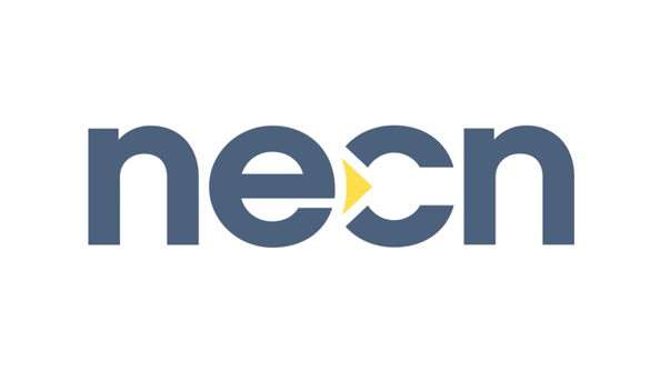
New England Cable News debuted a new logo earlier this fall.
The new logo, which trades dark blue and yellow for black and red, also features a more rounded typeface and adds a yellow arrow between the “e” and “c.”
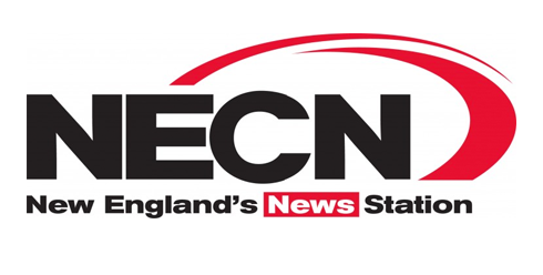
The previous NECN logo
The channel’s previous logo, shown above, featured a blockier typeface and two partial red rings.
The new logo is much more compact and has the circular curves found in each character give a cohesive look. That curved is even subtly incorporated into the left side of the arrow, which is slightly rounded to match the flow of the “e” next to it.
NECN is owned by NBCUniversal.
See another station that recently changed its logo.
Subscribe to NewscastStudio for the latest news, project case studies and product announcements in broadcast technology, creative design and engineering delivered to your inbox.

tags
logo, NBCUniversal, NECN, New England Cable News
categories
Branding, Cable News, Featured