
2018: Networks roll out special looks for inauguration day
Subscribe to NewscastStudio for the latest news, project case studies and product announcements in broadcast technology, creative design and engineering delivered to your inbox.
ABC
ABC News used a stacked logotype similar to its election logo, this was able to reduce the amount of text a bit.
That said, the network’s lockup awkwardly crammed in the word “of” in between the lines “Inauguration” and “Donald J. Trump.”

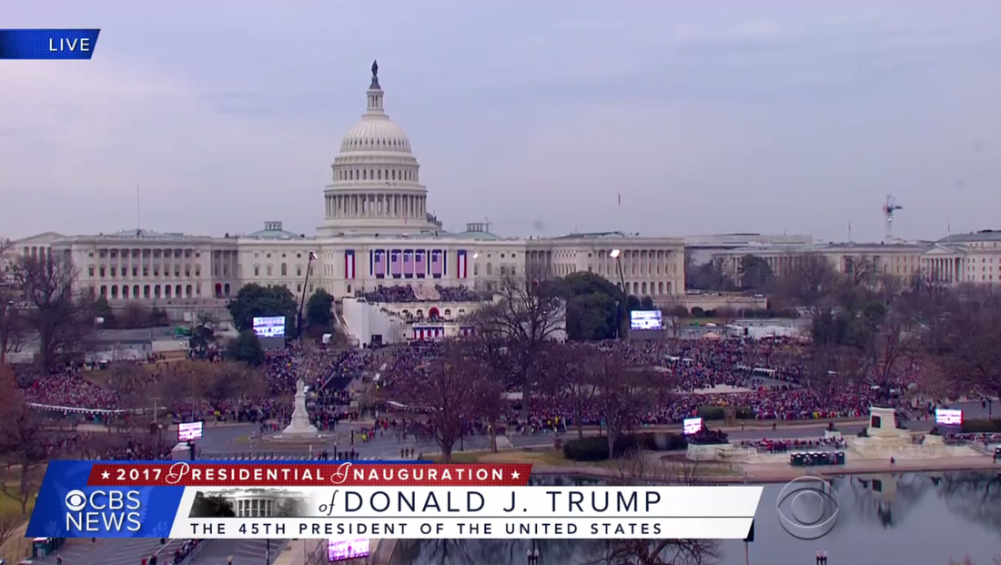
During network coverage, the network parked the logotype in a box in the lower left of the screen and kept a bar with “Inauguration 2017” in it up running along the bottom of the screen, which the network uses a sort of secondary brand for its coverage.
The network’s graphics, also heavily emphasizes vertical stripes in red, white and blue combined with colored photography, some of it was a masking effect.

It’s worth noting that ABC and NBC’s looks have some striking similarities, especially in the use of vertical red, white and blue bars.

Subscribe to NewscastStudio for the latest news, project case studies and product announcements in broadcast technology, creative design and engineering delivered to your inbox.

tags
ABC News, CBS News, CNN, donald trump, Fox News, inauguration, NBC News, trump
categories
Broadcast Design, Cable News, Elections, Graphics, Heroes, TV News Graphics Design