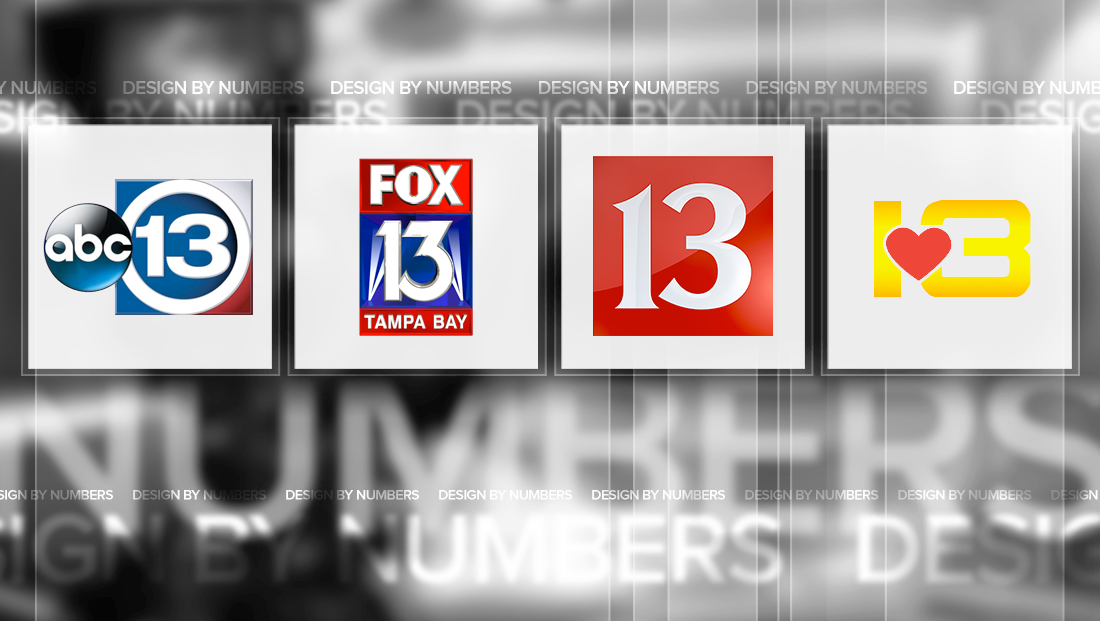
Notable Channel 13 TV station logo designs

Subscribe to NewscastStudio for the latest news, project case studies and product announcements in broadcast technology, creative design and engineering delivered to your inbox.
WTHR

WTHR in Indianapolis, uses a stylized “13” inside of a red box. The glyphs used in the “13” have distinct sharp “points” and curves. The logo is an updated version of the station’s previous logo that streamlines the logo but keeps the typeface the same. The previous version also included a gold “13” in favor of the silvery-white one in the station’s current version.

WMAZ

WMAZ, the CBS affiliate in Macon, Georgia, has one of the more unique Channel 13 logos out there. The centerpiece of the station’s logo is a heart — a reference to the station’s “Straight from the heart” tagline. With a simple vertical stroke for the “1,” the “3” in the design features an exaggerated width with slightly rounded corners. The typography in the logo isn’t its strongest point — the “3” in the logo could easily be mistaken for an “8.”
This post is part of a semi-regular series on NewscastStudio that takes a look at TV station and network logos that include the numbers 1 and up. These posts aren’t meant to be a comprehensive list of all logos featuring the number in question, but rather a look at notable logos with creative, historic or an otherwise significant impact on branding design. If you have other logos with the number featured in this post, feel free to share it in the comments and stay tuned for a “reader’s favorites” version of this post coming soon.
Subscribe to NewscastStudio for the latest news, project case studies and product announcements in broadcast technology, creative design and engineering delivered to your inbox.


tags
design by numbers, houston, indianapolis, ktrk, macon, tampa, wmaz, wthr, wtvt
categories
Branding, Design By Numbers, Heroes, Local News