
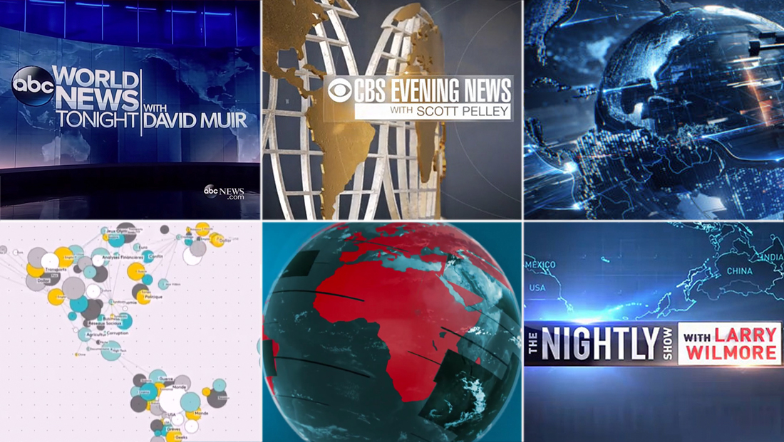
10 ways the world has used in TV news graphics
Subscribe to NewscastStudio for the latest news, project case studies and product announcements in broadcast technology, creative design and engineering delivered to your inbox.
Franceinfo

Franceinfo uses a simple “mind map”-like design of interconnected circles to suggest the outline of the world map. The graphics also make use of a teal, gray, white and goldenrod color palette.
RTVS

Slovakian broadcaster RTVS created a dynamic graphics package revolving around a globe but with a twist — bold red continents against teal-blue oceans.

Subscribe to NewscastStudio for the latest news, project case studies and product announcements in broadcast technology, creative design and engineering delivered to your inbox.

tags
ABC News, CBS Evening News, CBS News, CNN, Franceinfo, NBC Nightly News, RTVS, The Nightly Show, tom foreman, Vesti Nedeli, world news tonight, wplg
categories
Branding, Broadcast Design, Featured, Graphics