‘Across America’ gets A+ treatment

Subscribe to NewscastStudio for the latest news, project case studies and product announcements in broadcast technology, creative design and engineering delivered to your inbox.

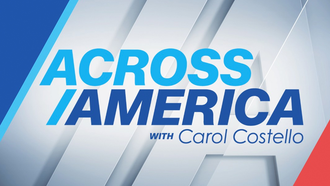
The map, meanwhile, makes another prominent appearance in full screen wipes and other elements, where it is more of a focal point, with red dots connected by white lines that match the angle of the other elements while also incorporating an outlined version of the letter “A.”

At the start of the show, the upcoming stories are teased with a fullscreen graphic with a large “headline.”

The headline text then animates into the upper left of the screen with topical imagery shown covering most of the screen real estate. The look is accented by an “Across America” logo in an angled box in next to the HLN bug and subtle semitransparent angled elements on either side.

The text then can change when it moves again — this time to the bottom of the screen. Here, the angled sides are also used, which is a notable departure from the rounded corners of the lower third insert graphics the network normally uses, including during the bulk of “Across America.”
Subscribe to NewscastStudio for the latest news, project case studies and product announcements in broadcast technology, creative design and engineering delivered to your inbox.


tags
Carol Costello, CNN, HLN, insert graphics, lower thirds
categories
Branding, Broadcast Design, Broadcast Industry News, Cable News, Heroes, TV News Graphics Design, TV News Graphics Package, TV News Motion Graphics Design