Telemundo’s World Cup look captures culture, grandeur of event
Subscribe to NewscastStudio for the latest news, project case studies and product announcements in broadcast technology, creative design and engineering delivered to your inbox.
With an eye towards the significance and scale of the event, Telemundo’s World Cup presentation features a combination of cultural and modern design cues.
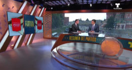
Along with its sleek set design, the network’s motion graphics help capture the story and set the scene.
Creating the system was the task of Big Block, a Los Angeles creative studio, alongside the Telemundo Deportes creative services team.
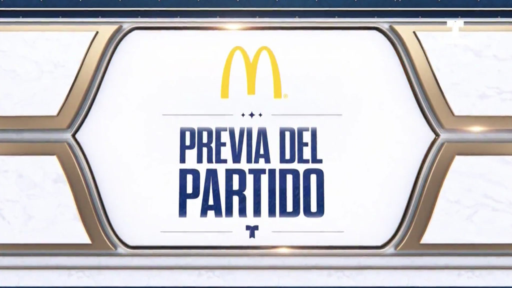
Defining the look
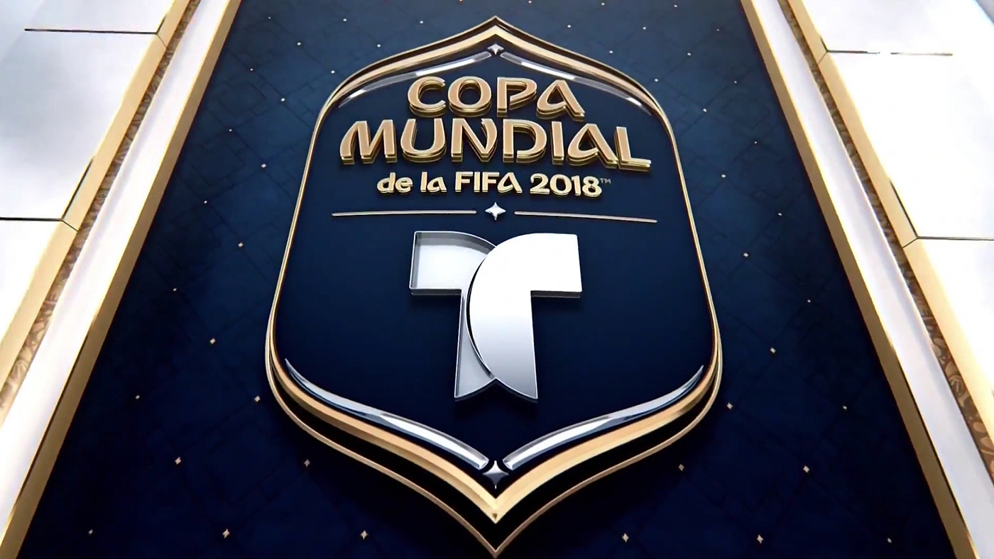
Working inside FIFA’s branding guidelines for this year’s World Cup, such as using the required font, Big Block first worked to define the logo treatment for Telemundo.
“We looked to Russian architecture and tradition to figure out the materials and aesthetic structures for the logo,” notes Curtis Doss, a creative director at Big Block. “Certainly the trophy plays a big part in what we developed, borrowing the gold and some of the texture.”
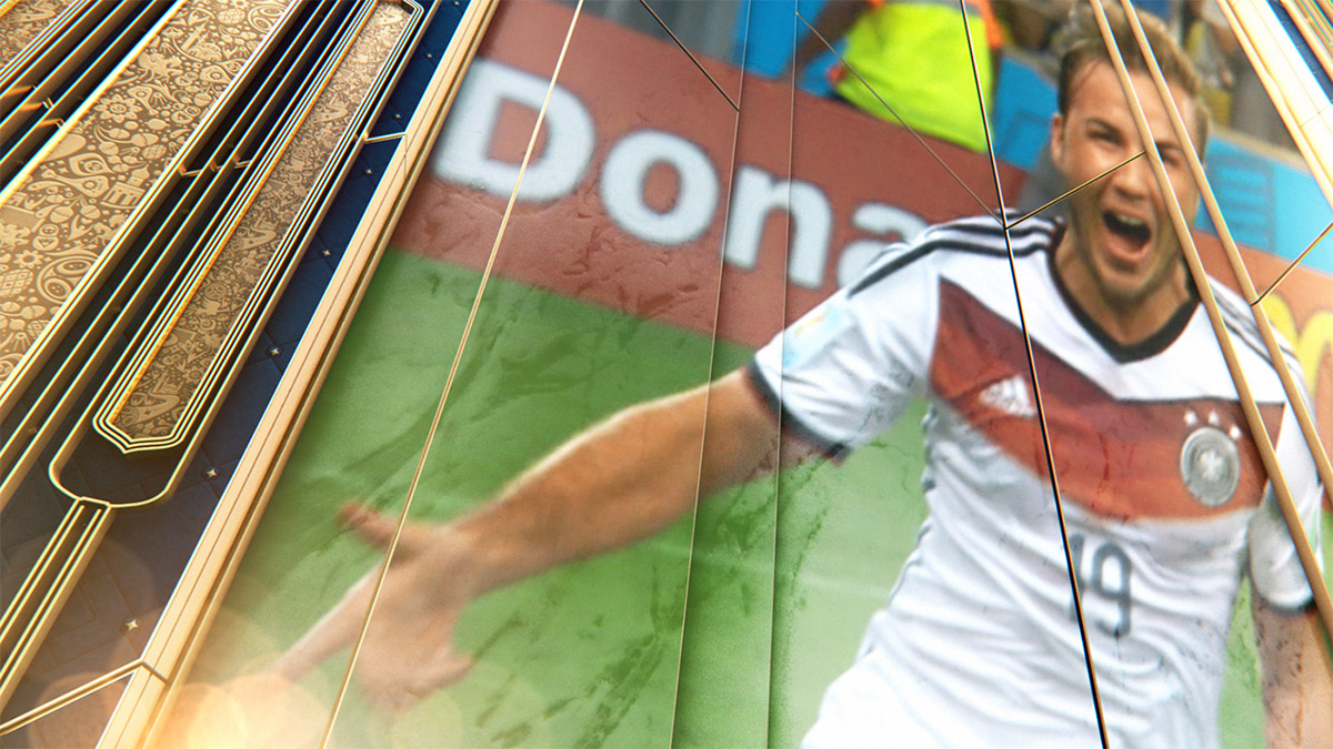
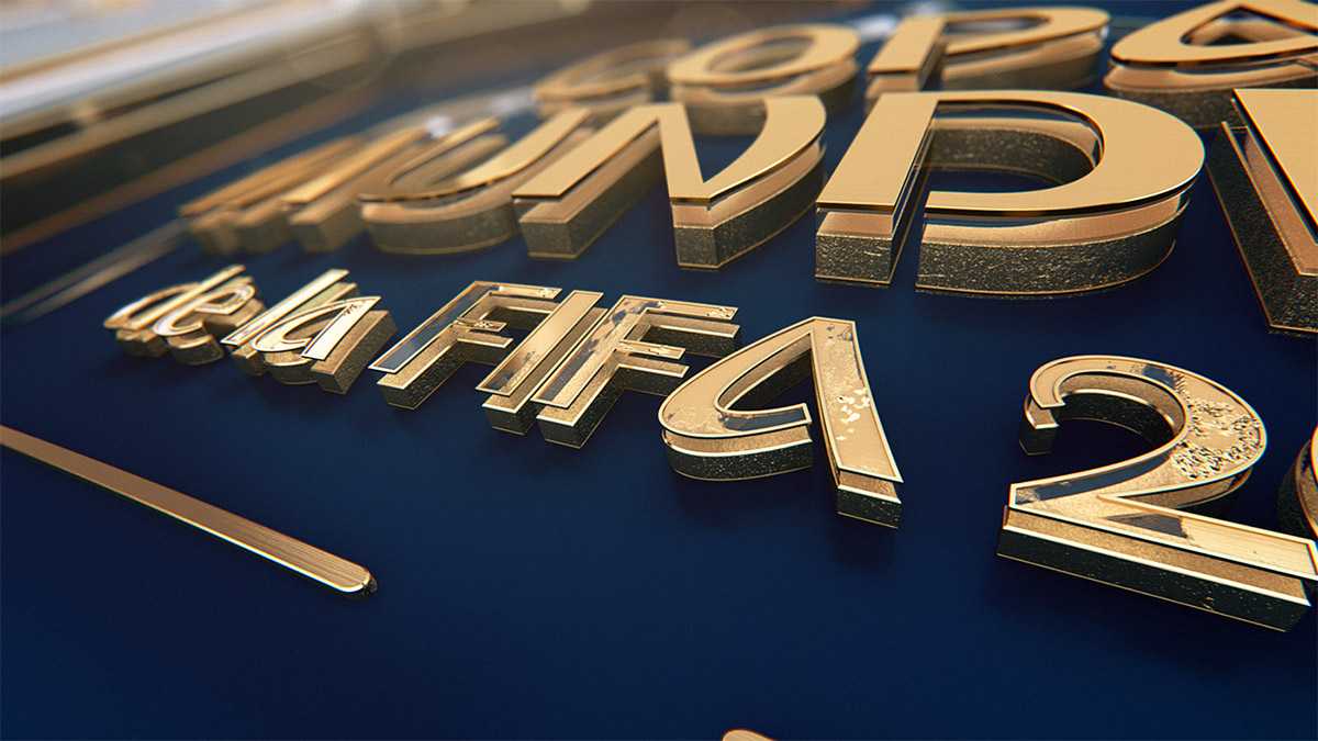
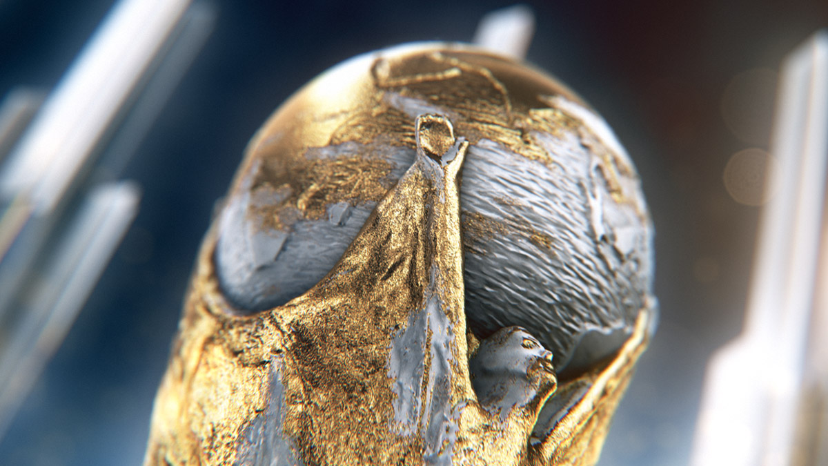
For the opening sequence and overall graphics package, including elements like full-screen graphics, interstitials, wipes, etc., cues were taken from Russian décor and finishes, such as heavy use of gold and marble textures.
“We wanted to capture the history and cultural significance of this country in an elegant way that also spoke to the grandeur of the event taking place in a modern time,” said Eli Velazquez, Executive Producer, Production, Programming and Content at Telemundo Deportes.
“We’re using gold foiling on [blue] felt to try to give a real tangible to the elements that we’re creating, even though, keeping them in a very graphic nature so that you’re not worried about where it [the package] is grounded, necessarily,” adds Doss.
Telemundo’s overall motion graphics package is abstract in the sense that it does not try and define a place, with the graphics instead of being organic in nature.
“You don’t have to define exactly where it is, but these textures and shapes can be of very real materials and inspired by real world physics.”
Entering the world stage
The overall package evolves with the World Cup, changing colors in the later rounds and using contrast to help tell the story.
“As we progress, the package will get a little bit more dramatic,” said Doss. “You’ll see some visual changes going from black to white, or going from white to black to signify the importance and weight of where those teams are heading.”
“Some of the wipes and interstitials took on new forms, colors and shapes over time and to keep our audience engaged visually,” adds Velazquez.
Subscribe to NewscastStudio for the latest news, project case studies and product announcements in broadcast technology, creative design and engineering delivered to your inbox.

tags
2018 World Cup, Big Block, Cinema 4D, FIFA World Cup 2018, graphics package, Immediate Music, maxon, maxon cinema 4d, telemundo, Telemundo Deportes, viz virtual studio, Vizrt, Vizrt Viz Libero, world cup, World Cup 2018, Yoav Goren
categories
Branding, Broadcast Design, Graphics, Heroes, Real-Time Graphics, Sports Broadcasting & Production