
Platinum Jubilee gets plenty of purple, Trajan treatment — but with some twists mixed in
Subscribe to NewscastStudio for the latest news, project case studies and product announcements in broadcast technology, creative design and engineering delivered to your inbox.
CNN, meanwhile, also went the purple-and-Trajan route — with a bit more bokeh-like sparkly effects mixed in and a script-style typeface used for the word “Queen Elizabeth” as if it was her signature.
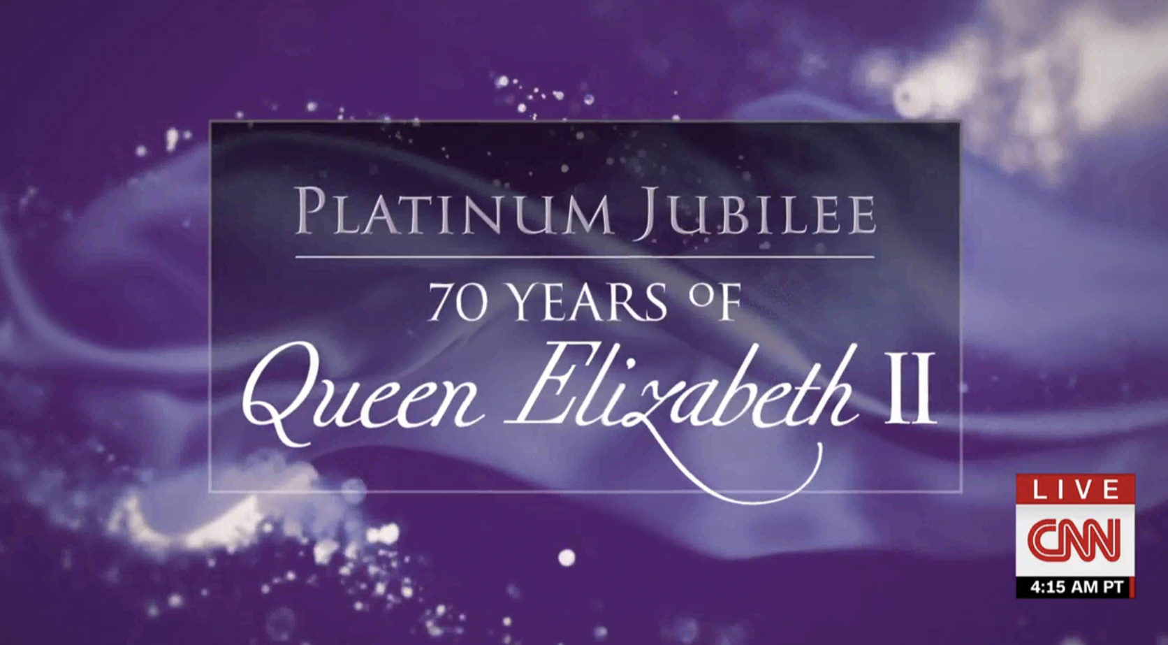
Officially titled “Platinum Jubilee: 70 Years of Queen Elizabeth II,” the network also made the somewhat odd choice of making the “o” in “of” about half the size of the rest of the line of text and placing its baseline midway up, making it look a bit like a degree-symbol (°) — an issue that was made a bit more confusing given that “F” is also a common abbreviation for “Fahrenheit.”
CNN also used its lower third banner space to showcase a timeline of events in a matching design, a common tactic the network uses.
Subscribe to NewscastStudio for the latest news, project case studies and product announcements in broadcast technology, creative design and engineering delivered to your inbox.

tags
ABC, ABC News, CNN, Fox News, GMA3: What You Need to Know, Good Morning America, NBC News Now, Studio 1A Rockefeller Center, times square
categories
Branding, Broadcast Design, Broadcast Industry News, Heroes, Network Special Reports, Networks