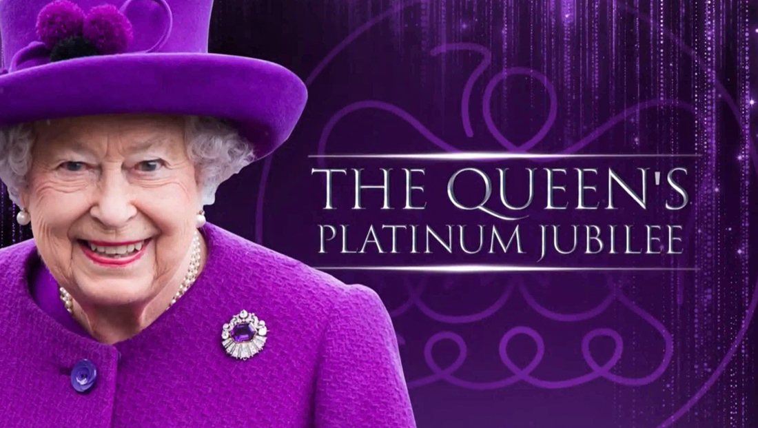
Platinum Jubilee gets plenty of purple, Trajan treatment — but with some twists mixed in

Subscribe to NewscastStudio for the latest news, project case studies and product announcements in broadcast technology, creative design and engineering delivered to your inbox.
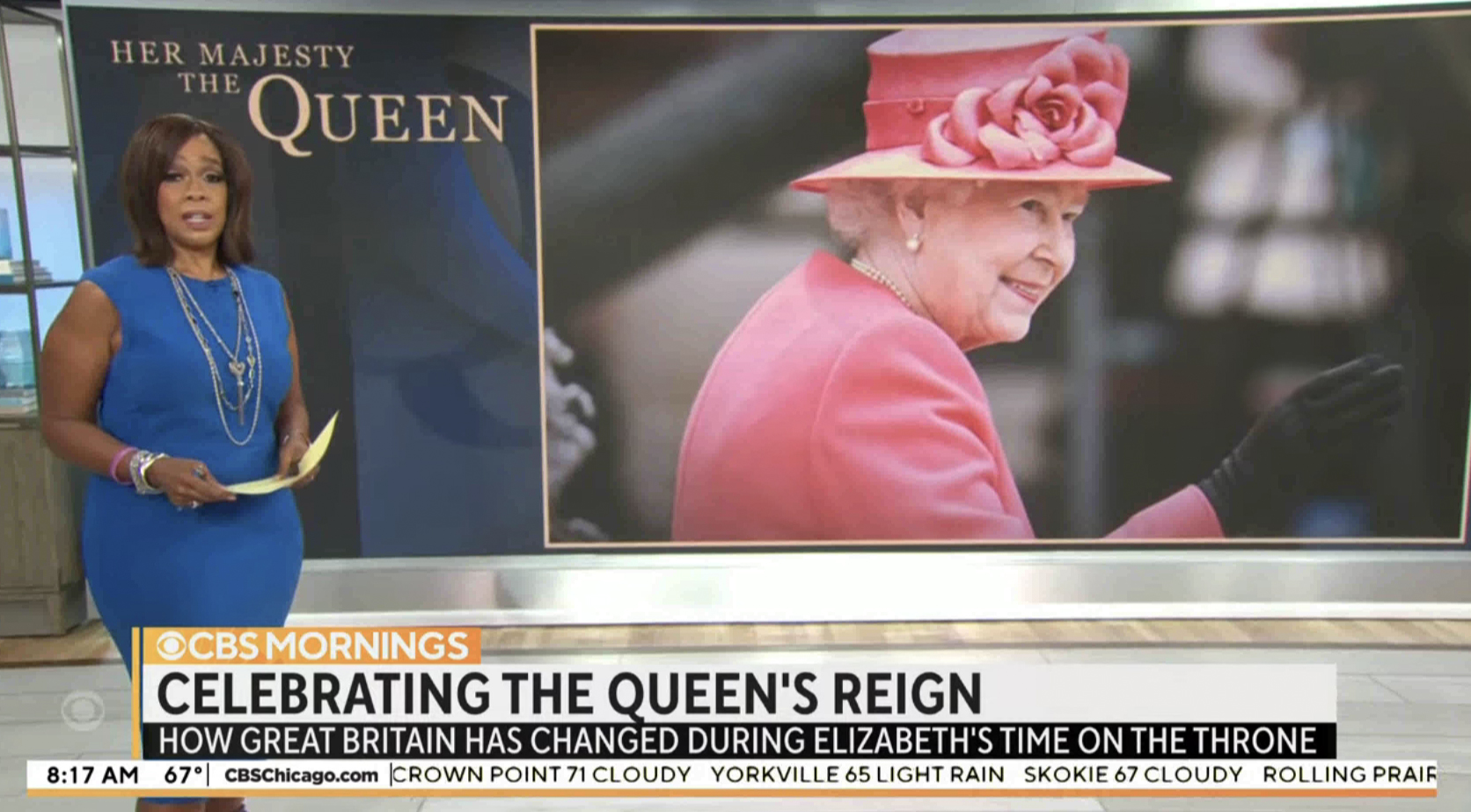
CBS News took the somewhat unusual route of using a blue and rose gold color scheme, with coverage titled with “Her Majesty the Queen” in a rather poorly composed logotype that included an exaggerated “Q” that ended up looking unbalanced in weight. The “Q” element was used as a repeating background element as well.

Despite its rather weak logotype, CBS does deserve a nod for at least attempting a non-violet color scheme and not using Trajan or something similar. The cleaner, geometric look used by layering “Q”s was also a standout look with hints the network’s overall strategy of using the “deconstructed” approach to its visuals.
Subscribe to NewscastStudio for the latest news, project case studies and product announcements in broadcast technology, creative design and engineering delivered to your inbox.


tags
ABC, ABC News, CNN, Fox News, GMA3: What You Need to Know, Good Morning America, NBC News Now, Studio 1A Rockefeller Center, times square
categories
Branding, Broadcast Design, Broadcast Industry News, Heroes, Network Special Reports, Networks