
‘Nightly’ doubles down on ‘N’s, unique blend of 3D, flat design in new look
Subscribe to NewscastStudio for the latest news, project case studies and product announcements in broadcast technology, creative design and engineering delivered to your inbox.
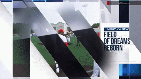
Tease headlines
Perhaps one of the biggest updates to the “Nightly” graphics are the tease and headline designs.
Whereas these previously had the same layout for each story, “Nightly” now has a variety of layouts, all based on the same general theme, with slick animations between each.
This approach differentiates the broadcast from “ABC World News Tonight” and “CBS Evening News,” which both use the same general, fullscreen layout with graphic overlay throughout their headlines.
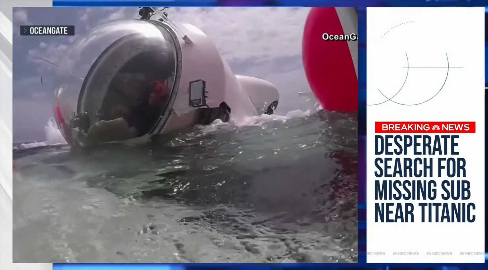
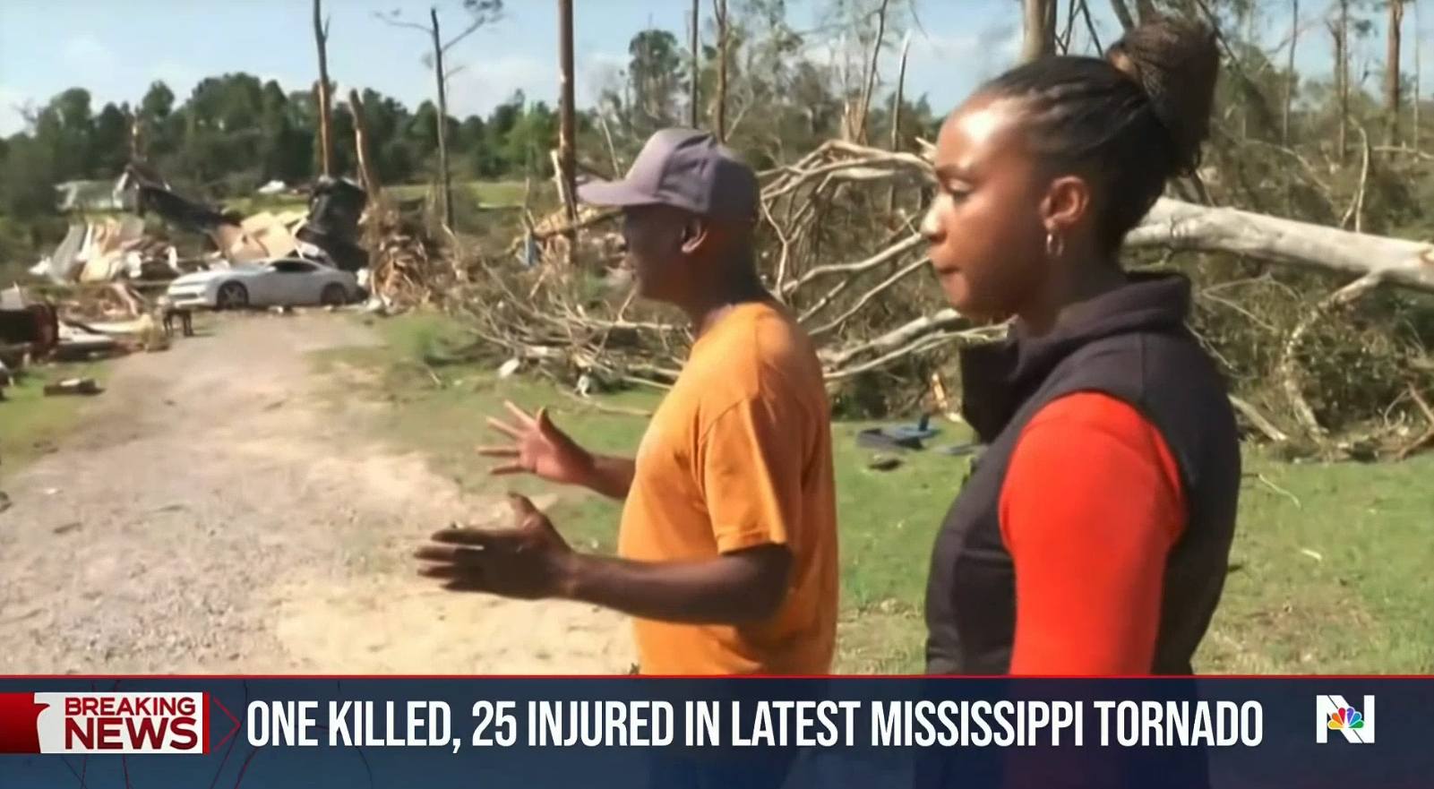
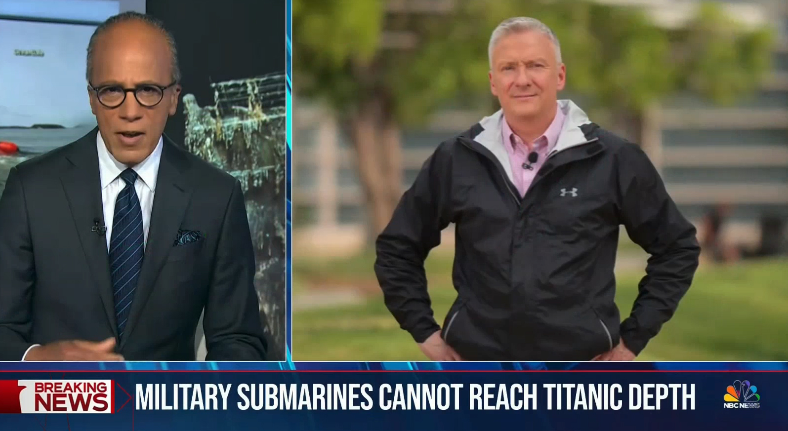
The central concept of the tease headlines is a white box on either side of the screen with headline text spelled out inside of it. There is the option to include a “breaking news” or other branded flag, separated by a peacock, alongside the accompanying imagery.
Because the text container now takes up roughly a third of the screen width, the frame for imagery has been adjusted accordingly, almost becoming a 4:3 aspect ratio, though “Nightly” appears to have the option to decide how the stills or video are cropped.
Other elements from the headlines segment, which is also used as the basis of “coming up” tease looks, include light gray “NBC News” repeating microtext and a series of thin circular segments and horizontal lines, which can be read as a nod to the globe as well as the curved portion of the peacock feathers. There’s also a tie-in to the curved, glossy white column and header elements and feather-inspired window screen on the “Nightly” set.
The headlines continue to feature the drumbeat bed that’s been used, in various variations, for years.
Open
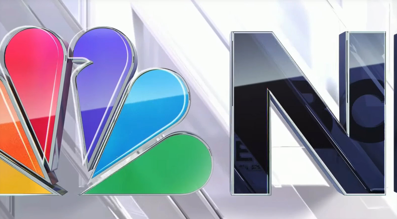
The newscast’s open remains approximately the same length as before but now uses the diagonals in the double “N” design to create a transitional effect.
This design is highly glassy with offset outlines with diagonal elements angles matching that count in the center of the “N.”
The first, very short scene in the open is a full color rendition of the updated peacock icon next to the letter “N” and a very small portion of the “B,” another way that emphasizes the package’s tilt toward referencing the letter “N.” The view then switches to an oversized view of “Nightly” and “News” stacked on top of each other in black before cutting to the final, full title screen before a diagonal opening and zoom through the the bottom of the “H” in “Nightly” reveals Holt in the studio.
The final view of the logo is briefly framed by horizontal elements on either side of the screen before the logo grows slightly and these glassy shapes move off-screen.
Meanwhile, the announcer and opening theme remain unchanged.
Insert graphics
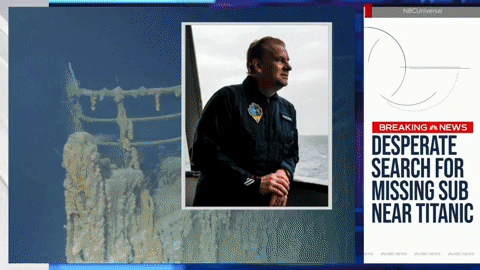
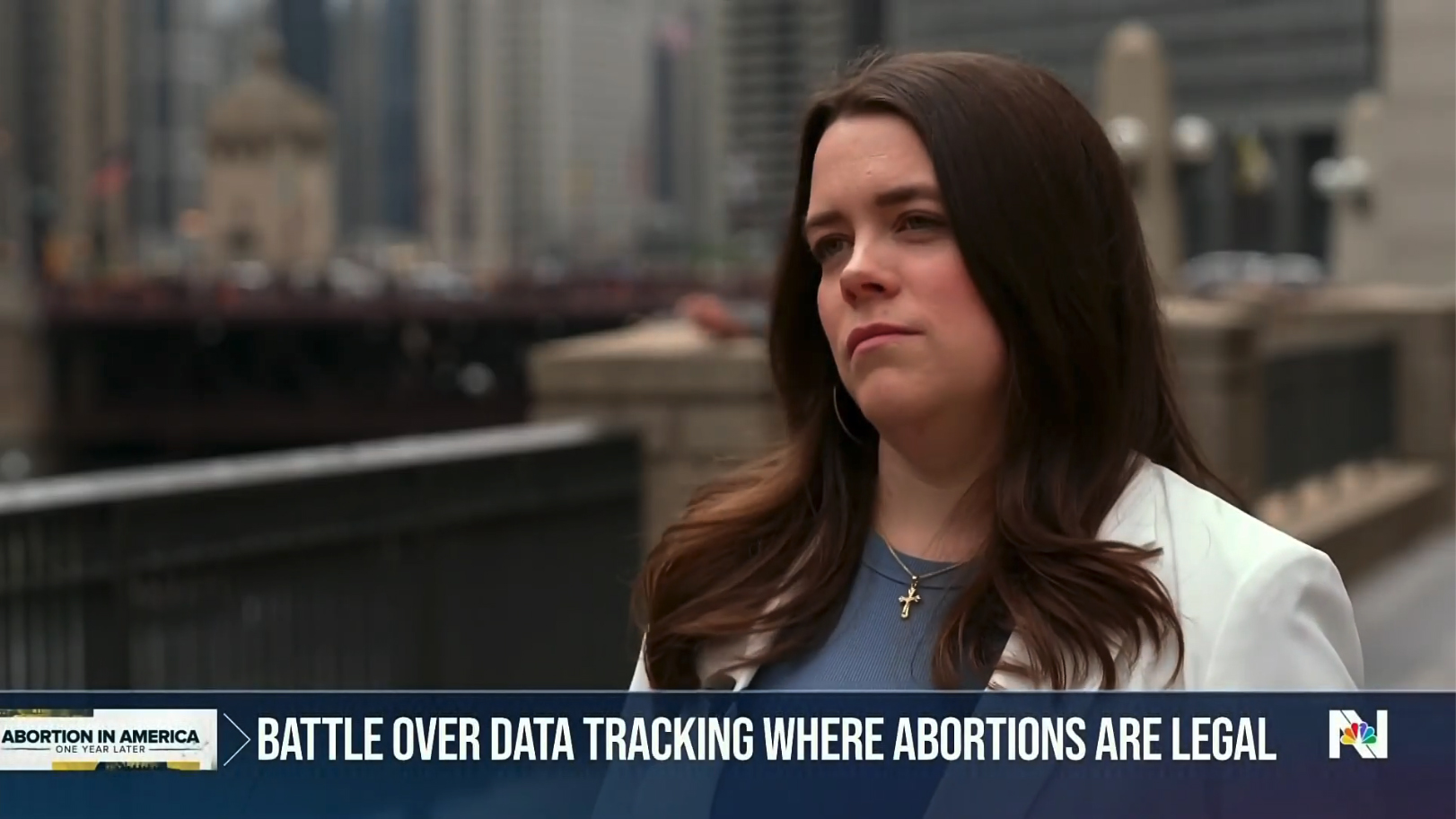
“Nightly” also received completely redesigned insert graphics including a full-width lower third.
These graphics center around the concept of a dark blue background that extends the entire screen width and is approximately one-seventh the height of the screen.
This layout has visual conceptual similarities to the designs NBC News uses during special coverage, though it does lack the on-screen branding bar that typically remains on-screen the entire time, tying into the insert graphic added above as needed.
The blue background is semi-transparent, allowing faint hints of the imagery behind it to show through.
Inserts can have a branded element in the far left, such as “breaking news” or a franchise or series logo. In the previous look, this element was typically added as a single tier above the primary lower third box, which allowed them to be a bit more legible than in the new format.
The top of the lower thirds features a thin line, which can be red for breaking news stories, white for other coverage or a matching color for franchise stories.
The left hand side of the banner text features a thin chevron, which doubles as both a visual cue as to where to start reading as well as a reference to the angled, “N”-inspired look.
Meanwhile, the blue banners can also have faint peacock and circular outlines in the background.
There is also a standalone variation that can be used without any branding in the left-hand position. This features a white chevron and adds an underline beneath the text while removing it from the top of the banner.
Like other elements accents throughout the package, the underline has a small, thicker segment that slowly moves from left to right.
Like in the newscast’s previous look, insert graphics used to identify correspondents or interviewees still occupy the same space as the topical headline text.
These are, somewhat oddly, displayed as two tiers of left-aligned text separated by a thin line rather than being center aligned.
The text does, however, become centered in the sense that the graphics system calculates the widest part of both tiers and then centers the text’s footprint within the space between the left graphic and the bug on the right.

Insert graphics continue to have an animated entrance option, a design centered around the “NN” icon. This element flickers onto the screen, either in red or white, before the two parts separate to reveal the blue banner in between. When necessary, a brief outline version of “breaking news” is always displayed, with the alternative being the words “Nightly News.”
While Tinker is still used for some parts of insert graphics, such as the “breaking news” box and in correspondent titles, the rest of the text is now in Bebas Neue, a condensed sans serif that allows producers to maximize the amount of text that fits into a space.
This essentially replaces Effra, a wider sans serif that was used before and that often ended up look “scrunched” in order to fit higher word counts in the inserts.
Bebas was previously used in select cases by “Nightly” when a higher word count was needed, particularly in OTS boxes and video wall graphics.
It is, however, distinct from the similar condensed sans serif Flama Condensed used by “Today.” This font, among others, also appears cross NBC News platforms, including in weather graphics that are used by multiple broadcasts.
It’s not clear what more traditional boxed OTS graphics will look like because these are typically only used when the broadcast is produced from the field.
It also remains to be seen if “Nightly” will continue the practice of simulating the 1A video wall backgrounds on select weekend editions or if it will attempt to replicate this new look in Washington, D.C.’s Studio N6 or Studio N5 or the network’s Los Angeles bureau when the broadcast originates from one of those locations.
Bug
As it has done for some time, “Nightly” continues to feature an animated bug that rotates between the NBC News logo with full color peacock, the words “NBC Nightly News” divided between three lines and the “NN” icon.
Animation includes a diagonal flourish across the show logo. This is followed by “Nightly” and “News” exiting via an outline and block effect and the peacock icon growing in size, with the words “NBC News” sliding in below. There is then a brief diagonal effect that converts the logo to an outline before the peacock gains a white border and shrinks down in size to sit in the middle of the “NN” lockup.
This too gets a diagonal animation that briefly shifts portions to outline format before it opens, much like in the insert graphic entrance animations, to loop back to the “NBC Nightly News” version of the bug.
Continue reading to learn more about video wall looks and camera blocking…
Subscribe to NewscastStudio for the latest news, project case studies and product announcements in broadcast technology, creative design and engineering delivered to your inbox.

tags
logo design, NBC, NBC News, NBC Nightly News, nbc peacock, NBC Tinker, Studio 1A Rockefeller Center
categories
Branding, Broadcast Business News, Broadcast Design, Graphics, Heroes, Network Newscast, Networks