
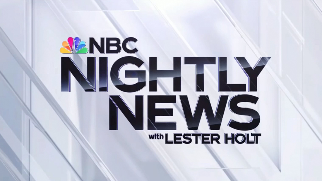
‘Nightly’ doubles down on ‘N’s, unique blend of 3D, flat design in new look
Subscribe to NewscastStudio for the latest news, project case studies and product announcements in broadcast technology, creative design and engineering delivered to your inbox.
Transitions and wipes
The new package also includes several wipe options, including one featuring the “N” elements merging together and then separating.
A variation adds in text accents.
There is also a flatter, more violet design that includes text accents.
Video wall graphics and blocking
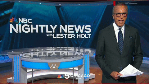
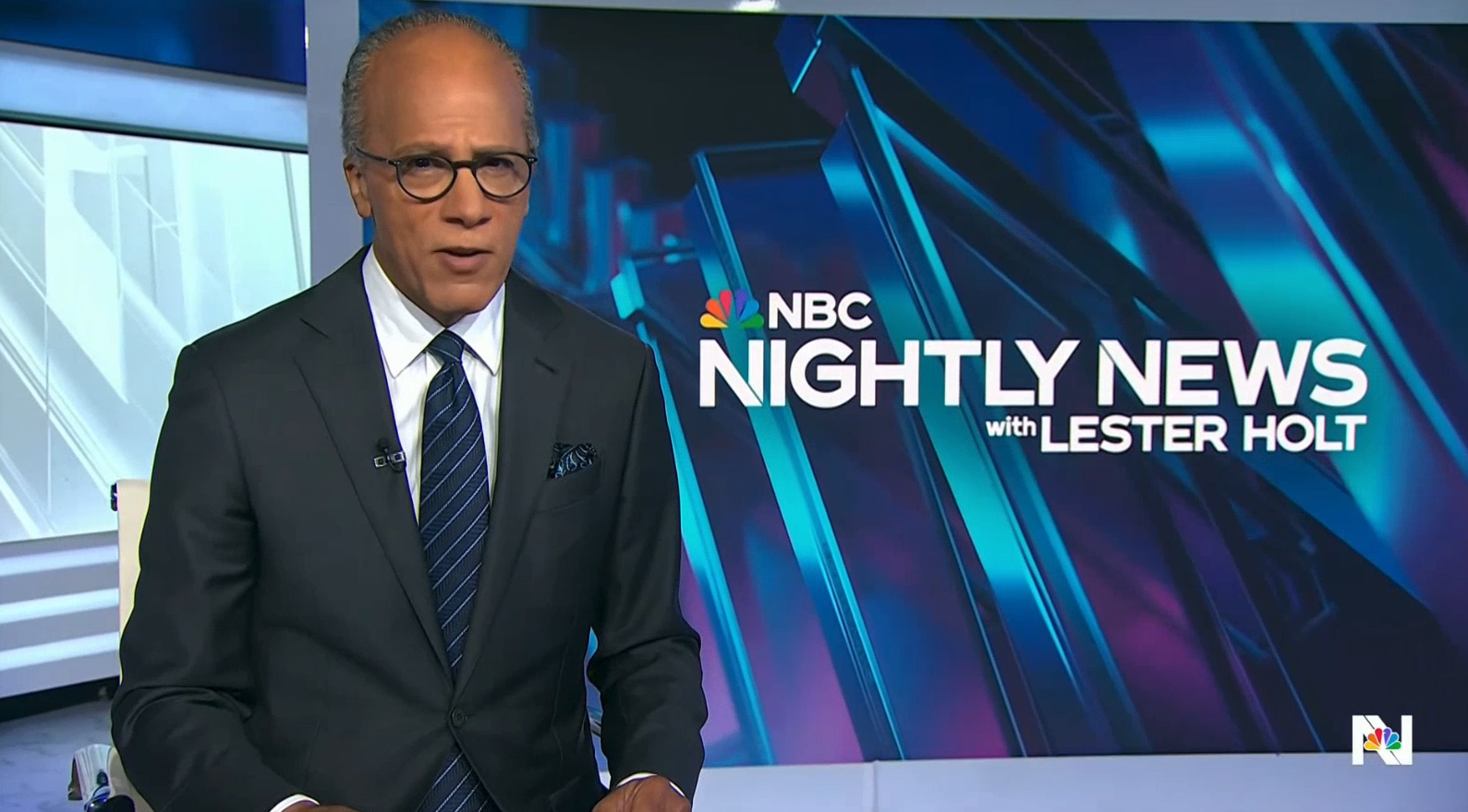
“Nightly” remained put in Studio 1A, also the home of “Today,” and continued to block its shots essentially the same.
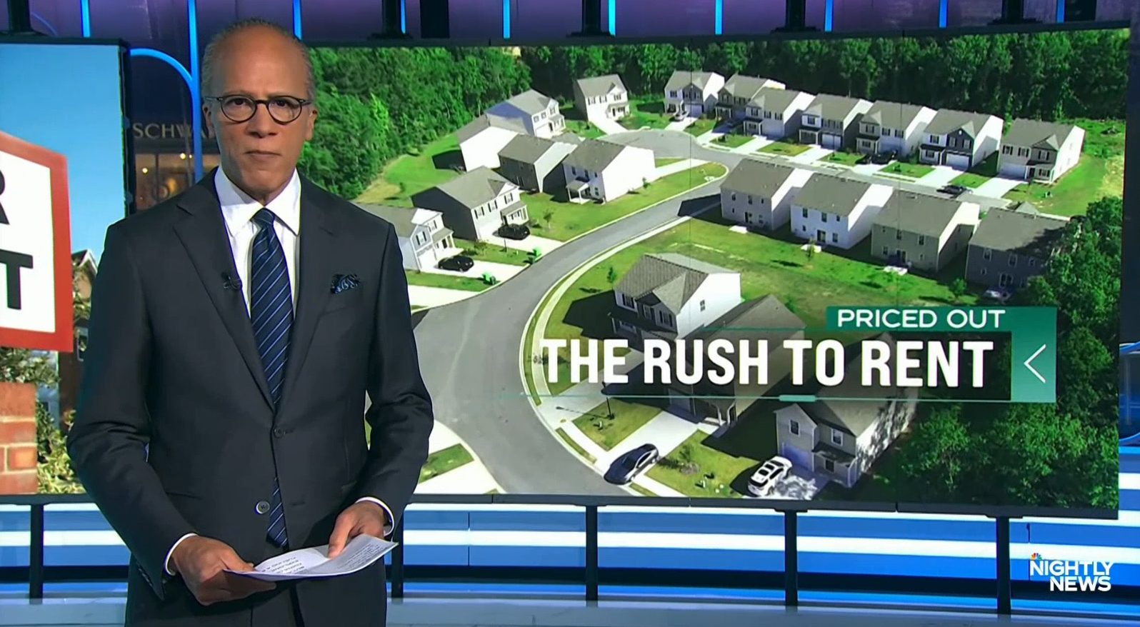
It continues to have Holt standing in front of the 40-foot curved video wall in one corner of the studio for both the top story and kicker intros, with a mix of “video on video” shots mixed in to showcase maps, key facts and quotes as needed at the start of the broadcast.
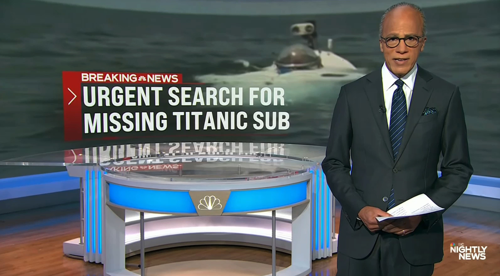
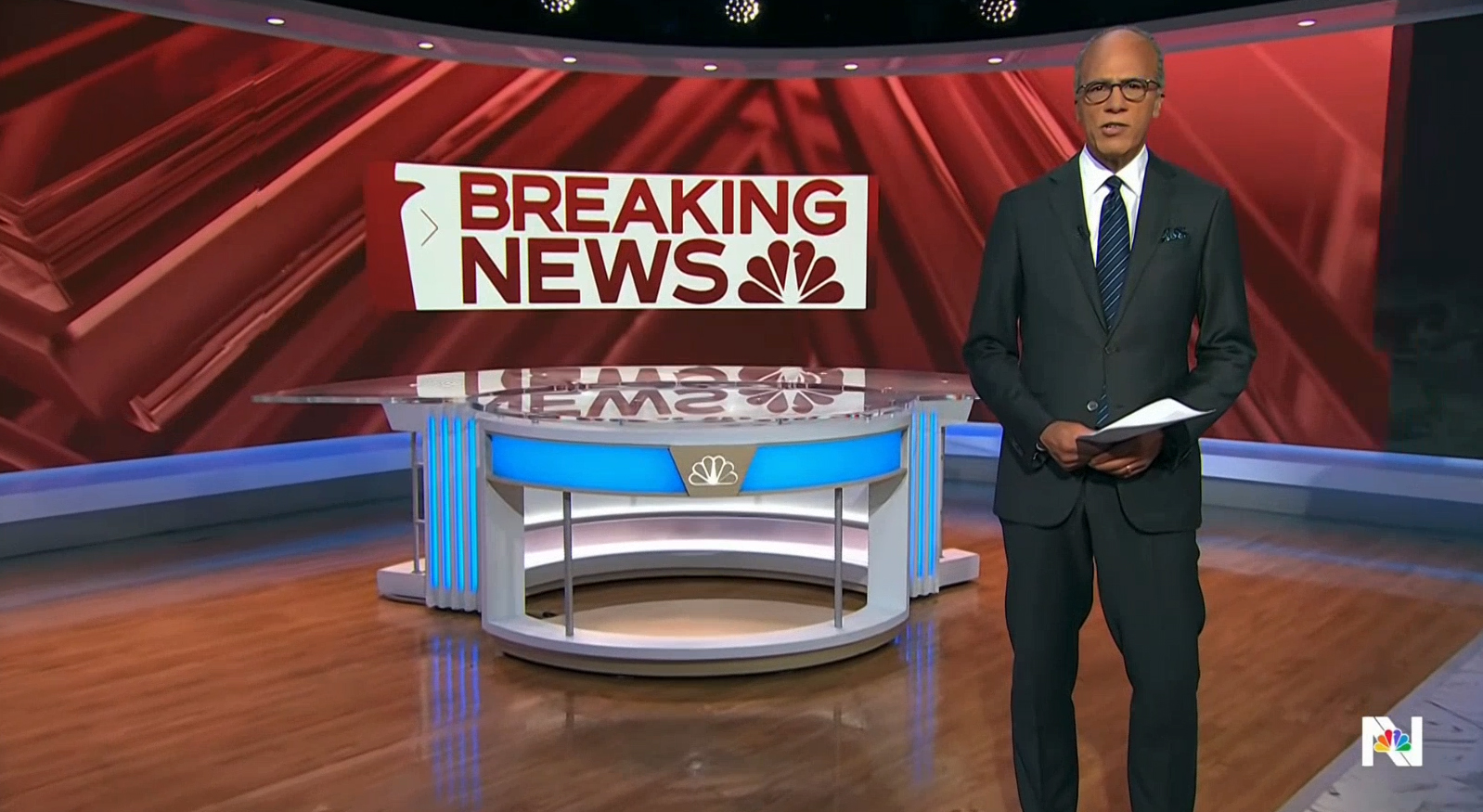
The video wall starts with the glassy animated “N” loop in blue behind Holt with the full logo.
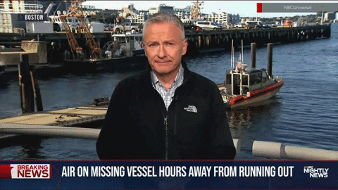
There is then the option for the background to turn red and the words “Breaking News” to appear before switching to a full width image or collection of images based on the story at hand. When needed, these images now feature a left-to-right transition wipe, as opposed to the vertical one used previously.
Much of the remainder of the newscast continues to be shot at the smaller anchor desk positioned in front of the flat video wall the network installed for 2020 election coverage and later moved into its current position.
This setup continues to leverage this primary video wall and additional LED installed farther back to showcase separate imagery. The LED header and column, meanwhile, typically showcase a blurred version of the 3D background, leveraging this multilayered part of the set.
One minor change that “Nightly” did make is to place one of the studio’s vertically-mounted video screens on a mobile cart framed with edge-lit glass to the far camera left side of the anchor desk. It now appears briefly in many anchor shots in this position and so far has simply been used to show the date when paced here.
Incidentally, that edge lit glass and the boldly lit corners of the glossy white surrounds in the studio are hinted at in many of the graphics, including both the 3D and flatter looks.
The six-segment motorized panels along one wall of the studio continue to be used behind Holt for one block.
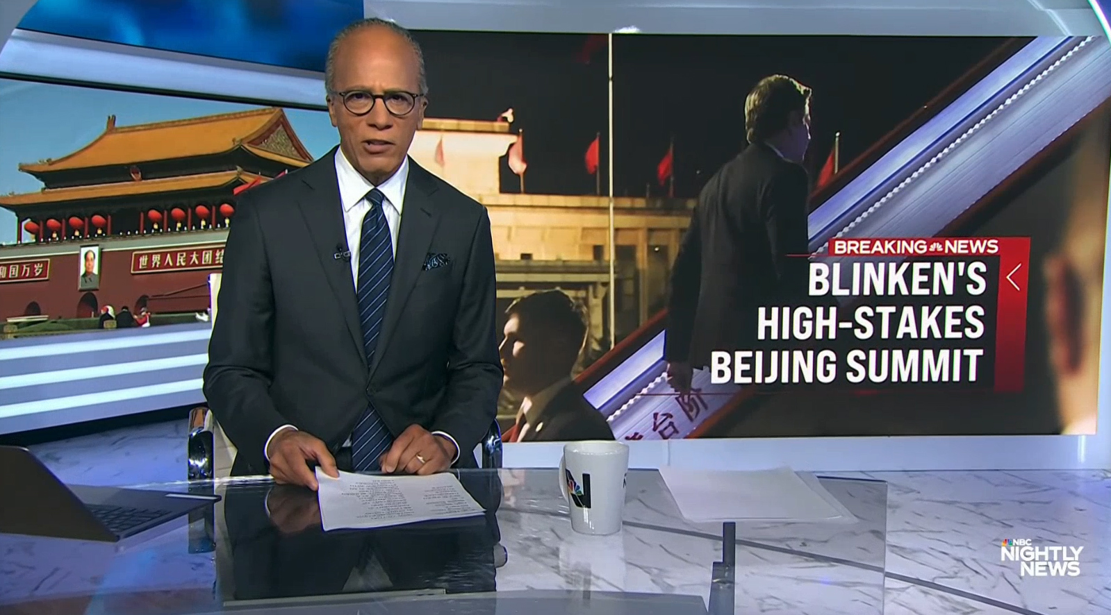
On all three of these video walls, story-related text can be inserted in the middle of each background along with a three-sided frame element that features a thick bar of color on either side, a slightly smaller container above for additional label or branding and a thin line with thicker segment below.
Together, these elements sort of “horseshoe” in the text, giving it a visual foundation of sorts. Another visual cue is added in the form of a thin white chevron in the side container that directs the eye toward the text.
On the largest video wall, text is typically left-aligned with the thickest element appearing on the left side. On the other video walls, right alignment is used most often with that bar moving to the right as well.
The color of the bars can be red for breaking news or blue or violet for other stories. It can also be recolored to green, for example.
Video wall graphics largely use Bebas for the primary font, with Tinker used in secondary applications, typically in the top line of text inside the colored bar.
Both video wall and fullscreen animations also incorporate boxed elements with the outline of the head of the peacock along the left side and text to the right. These typically feature text in Tinker with some odd spacing choices.
After the first night on the new graphics, “Nightly” also began using a simulated control room background behind Holt.
So far, this seems to be mainly meant as a generic placeholder graphic that’s used during segments that appear to pre-taped or that don’t have a graphic that reads well during the tighter one-shot on Holt during boxed segments, such as interviews or correspondent debriefs (it’s not uncommon for network newscasts to pre-tape parts of the newscast based on talent and interviewee availability).
The control room depicted behind Holt is not the loop of the network’s fourth floor newsroom that has frequently been used as a video wall loop. Instead, it appears to be a heavily composited image, perhaps based on a photograph, with many of the video frames filled in with various topical and branded imagery, including the old, Futura-based NBC News logotype displayed several times. A simulated band of frosted logos using Tinker has been added.
Overall, the “NBC Nightly News” on-air update is, if nothing else, daring and pushes the envelope. It’s easy to see how the design is an attempt to not only stand out but also appealing the younger audiences network TV is so often chasing.
The use of violet and lighter shades of blue, particularly in the animated 3D background, is particularly refreshing to see.
In certain ways, the new look has similarities to the designs introduced on NBC News Now, the network’s FAST news streamer in that it takes on a flatter look with subtle accents such as shapes, hashmarks and microtext.
The very glassy 3D look contrasts significantly with that shift toward a flatter look — though it’s not uncommon to see such combinations, particularly given that there is often a need for both depth and texture alongside flatter elements.
“Nightly” appears to have attempted to balance this out, though it’s interesting how the heavily-glassy 3D look went. It did, however, appear to fully commit to this design strategy by creating the look of multiple repeating layers, perhaps in a move to create even greater contrast between flat and 3D elements.
The ultra-glassy look of the animated “N” backgrounds also brings to mind CNBC’s design aesthetic.
There are also some notable similarities between this design and the glassy effects found in Look N, the now-retired NBC Owned Stations graphics package that was replaced in 2021 with Look S, a design that combined a flatter look with less glassy 3D elements and remains in use today.
On air, the design has some issues with overall cohesiveness, especially with the lower third insert banners. The fullwidth nature of these graphics do create an elegant feel but the shade of blue selected feels a bit out of place with other parts of the look.
There were also some potential opportunities to tie the lower thirds in more closely with the sideways U-shaped frames in the video wall graphics beyond just the use of the chevron that could have made the look feel a bit more unified.
Even the use of the glassy 3D renderings during “Nightly” itself feels a bit inconsistent — the blue backgrounds, despite still having detailed edge effects, manage to feel a bit more subtle. The white versions, however, come across with a different vibe.
This, along with the use of additional glassy and 3D effects makes the open feel like it’s largely on its own from a design standpoint.
Collectively, the entire look also strays a bit from the more “art deco” design style that NBC has said it is pursuing now, including in the design of Studio 1A itself, though the lightly outlined geometric accents are perhaps a step in that right direction for incorporating that feel.
The use multiple sans-serif fonts comes across as slightly inconsistent, though this is not at all uncommon in broadcast design today, including on both NBC and other networks. There is a condensed version of Tinker that was created by Capacity Studios in the 2022 update, though it’s notably not nearly as narrow as Bebas gets, which could have created issues with being able to accommodate the higher word counts needed for “Nightly.”
Subscribe to NewscastStudio for the latest news, project case studies and product announcements in broadcast technology, creative design and engineering delivered to your inbox.

tags
logo design, NBC, NBC News, NBC Nightly News, nbc peacock, NBC Tinker, Studio 1A Rockefeller Center
categories
Branding, Broadcast Business News, Broadcast Design, Graphics, Heroes, Network Newscast, Networks