‘Nightly’ mostly sticks to new look on Day 2, though it does update breaking news design
Subscribe to NewscastStudio for the latest news, project case studies and product announcements in broadcast technology, creative design and engineering delivered to your inbox.
In its second day on its new graphics package, “NBC Nightly News” mostly stayed the course with the new look for its June 20, 2023 broadcast.
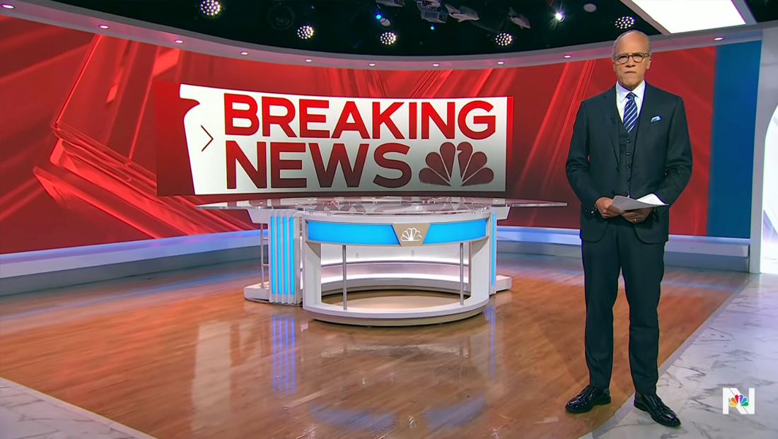
One significant tweak, however, was that the “breaking news” video wall graphic shown behind anchor Lester Holt at the top of the newscast is now a much more vibrant shade of red.
Before, the red looked muted — almost to the point of being considered a maroon.
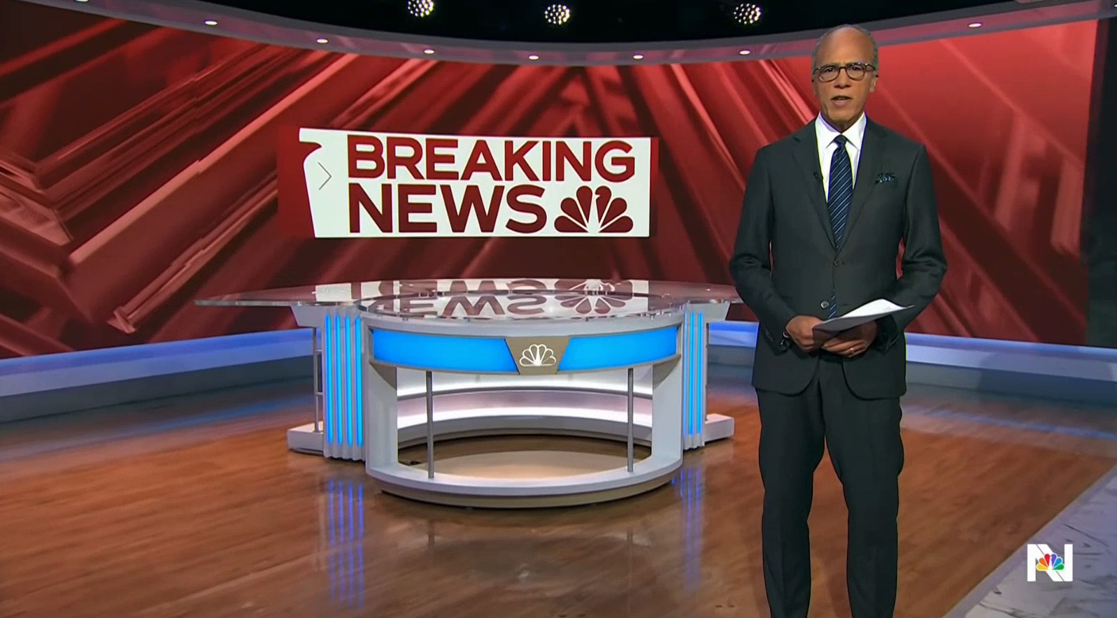
How the red ‘breaking news’ video wall graphic looked June 19, 2022.
The broadcast also enlarged the boxed “breaking news” icon that appears briefly on the video wall before transitioning to the full-wall imagery — to the point where it almost feels comically oversized.
The seemingly increased emphasis on the breaking news branding, through both the pumped-up red and larger text, largely reinforces the question of the broadcast industry’s tendency to use this label.
“Nightly” and NBC are not alone in this trend — both ABC and CBS, as well as other networks around the world have ventured down this path (“ABC World News Tonight” notably relies heavily on this label and peppers its scripts with lines such as “new developments” and “as we come on the air,” a trend that appears to have worked its way into both NBC and ABC broadcasts).
The potential overuse of the breaking news tag lead now former CNN CEO Chris Licht to issue an edict the reduce the network’s use of the term and its breaking news stinger.
Back at “Nightly,” there also appeared to be an odd shadow effect added to the lower part of both the full show logo and breaking news graphic just above the empty anchor desk placed behind Holt each evening.
This roughly matched the location of a shadow that was added behind the headline text that floated above the full-video wall imagery that appeared as Holt read his intro. This approach, which is common in broadcast design, was likely leveraged to help improve readability of text placed on top of photographs.
It’s also possible that the shadow was an attempt to reduce the reflection of the “breaking news” text on the glassy surface of the anchor desk because it appears to line up almost exactly with the portion of the screen where the two elements meet. The reflection did appear to be more muted on June 20 than on debut day.
Assuming the shadow was not done in error, this scenario could be supported by the fact that the shadow was on top of the text rather than behind it (the “breaking news” text in the graphic doesn’t need a shadow behind it to make it more legible since, by design, it has a solid white background already).
Despite the fact that new graphics looks often get tested extensively before they debut to the public, with tweaks being made throughout the process to make adjustments to how they appear on on-set video walls and panels or fullscreen looks, it’s not uncommon for additional adjustments to be made after the debut.
This could be in response to viewer feedback or simply based on decisions made by producers or executives after watching back the debut broadcast, which is often heavily scrutinized internally via port mortem meetings and reviews.
When the previous “Nightly” video wall graphics were updated in 2021, the blue background behind holt initially had brown-gold outlines of the show’s logotype, but this was removed by Day 2.
Subscribe to NewscastStudio for the latest news, project case studies and product announcements in broadcast technology, creative design and engineering delivered to your inbox.

tags
NBC, NBC News, NBC Nightly News, Video Walls
categories
Branding, Broadcast Business News, Broadcast Design, Broadcast Industry News, Featured, Graphics, Network Newscast