
ABC owned stations’ graphics package leverages purposeful motion, 3D

Subscribe to NewscastStudio for the latest news, project case studies and product announcements in broadcast technology, creative design and engineering delivered to your inbox.
Wipes
Most of these shorter 3D sequences double as transitional wipe elements.
The more rectangular looks are often envisioned as thick slabs that slide and rotate onto the screen before quickly exiting in a similar fashion. On both ends of full versions of these wipes, the edge of the slab is prominently visible. In some cases, the edges of these feature subtle hints of the horizontal ribbon motif found in the curved designs.
There is also an iteration where the graphical element animates vertically instead of horizontally.
The curved sequences, meanwhile, use a slightly different take when used as a wipe. These typically jump cut to the fullscreen with a ribbon-like look accented with squares of color at the start of the stinger.
After it has run, a space between two vertical bars near the left side of the screen opens to reveal video behind it, which is distinct from blocky looks that are depicted more as those slabs.
The package also has a variety of shorter, simpler wipes.
Lower thirds and banners
Much of the new look focuses on using motion with purpose, including careful attention paid to how elements enter and exit the screen.
In addition to the 3D rotation and reveal effects mentioned above, lower thirds also appear on screen using animated sequences with elements from the larger looks.

There are multiple distinct lower third options that have appeared on WLS and KTRK so far.
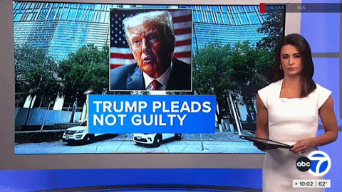
The first is the standard lower third used to showcase headlines and identifiers. These graphics sit inside a simple rectangle with blue gradient background and vary in width depending on how much text they contain.
There are also lower-third style banners for headline teases that in an off-white rectangle with thin accent line and “next” and “previous” style arrows in the lower right corner.
A similar layout is also used for bumps going into breaks that feature a thin rule with thicker segment and arrows.
A single line layout, with both large and small options, is used for single talent identifiers, while VSOT lower thirds used the double-line blue design. When both a banner and talent insert are needed, the reporter name can move up above the main blue box, including the ability to slide over next to the optional text flag here.
All three of these banner styles also have the option to add an additional box on the left side, which can vary from a topical image to text-based element.
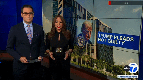
The final layout is used exclusively for two-anchor talent identifiers and features the station logo in the center and one anchor’s name on each side.
All of these lower third elements include entrance animations that use multiple colored rectangles that typically reveal content from the lower left corner moving toward the right. The exception is the double talent insert graphic, which uses a circle-based swirl entrance for the logo while colored boxes radiate outward in both directions to reveal anchor names.
In addition to these layouts, stations can also run larger, single line banner that then blends into the background when the station switches to a double box layout.
Subscribe to NewscastStudio for the latest news, project case studies and product announcements in broadcast technology, creative design and engineering delivered to your inbox.

tags
ABC Owned Television Stations, Acuity, ktrk, Rocket Surgery, Ross Acuity Production Switcher, Ross DashBoard, Ross Graphite, Ross Overdrive, Ross Video, Ross Video Datalinq, Ross Xpression, Vivid Zero, wls, XPression
categories
Broadcast Design, Graphics, Graphics Systems, Heroes, TV News Graphics Package, TV News Motion Graphics Design