
ABC owned stations’ graphics package leverages purposeful motion, 3D

Subscribe to NewscastStudio for the latest news, project case studies and product announcements in broadcast technology, creative design and engineering delivered to your inbox.
‘Loading’ indicators and dots
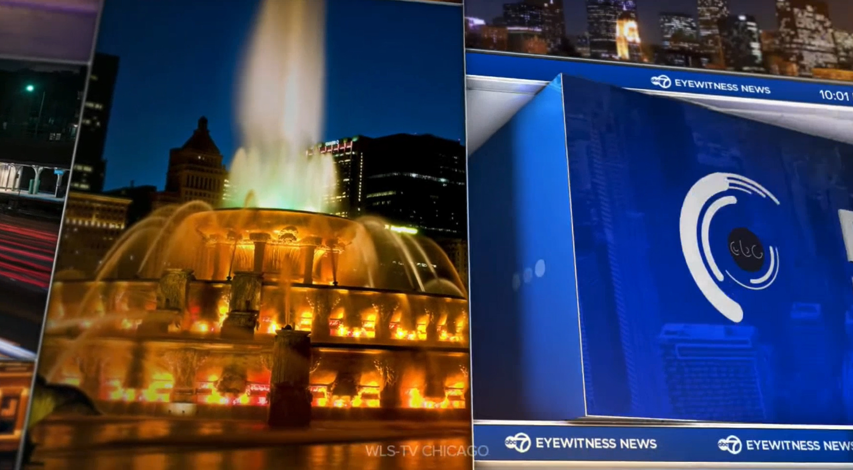
As the large blue area on the right rotates, the three-dot loading indicator on the left side of it is visible, while the Circle 7 logo animates in using a swirling animation, also reminiscent of a loading symbol.
The swirling concentric rings, which appear to be a nod to the ABC globe, appear to be designed to replicate the “loading” indicators found on many digital platforms. The animation is used throughout the package, including the option to animate in the logo bug, which sits on top of a white bar that rotates between newscast branding, social media handles and the current time and temp, with the width changing slightly as needed.
Out of ABC’s eight owned stations, all but one, WTVD in Raleigh, North Carolina, have a logo with a strong circular element, so it’s easy to how this animation could be used in other markets. The sequence could still be used at WTVD, which uses two bold yellow ones, thanks to the ABC logo that typically sits to the right.
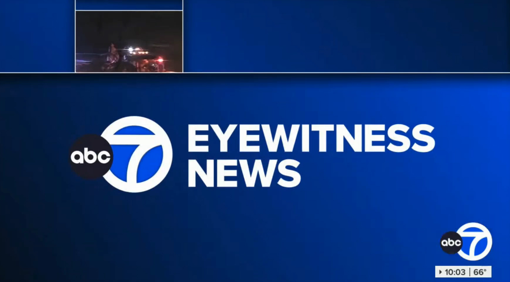
Four of ABC’s owned stations, WABC, KABC, WLS and KGO, use a variation of the famous “Circle 7” logo alongside the ABC globe, both of which tie into the circular loading sequence.
Circles are also found in the form of three ellipse style dots, which is often used as another type of loading indicator, including on the left side of the blue block with newscast logo on it in the opens — a clever literal interpretation that the “newscast” is “loading.”
The ellipse also finds its way into header bars, where it’s more decorative.
Meanwhile, circles can also be used for on-screen bullet lists that typically appear against a fullscreen graphic background. In these cases, each bullet point enters as it’s mentioned in the anchor VO, with the latest one remaining a ring as opposed to solid dot.
Fullscreens, video walls and OTSs
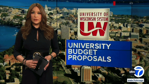
Fullscreen graphics, meanwhile, are typically designed with a strong vertical element to the left of the screen along with an arrow accent and header bar that enters in a similar way to lower thirds. The overall fullscreens also use a side-to-side animation to appear on screen and can be combined with maps, images, mugs or other graphics.

There is also a boxed OTS template and both stations also use slight variations on the graphics package for topical video wall graphics.
The package also includes a handful of other elements used less frequently or, at least so far, only at one station or the other.
These includes animated wipes that use either a boxy outline look, simple logo in the center of the screen or two vertical bars.
Color
While blue appears to be the dominant color at both WLS and KTRK so far, the two packages do use slightly different color palettes — blue, white and gold in Chicago and red, white and blue in Texas.
WLS does use red elements for breaking news stingers, whereas KTRK uses them in its default look as well.
WTVD and KFSN both have yellow and blue logos, though in two different shades, so it’s possible each could incorporate their own colors, respectively. The rest of the stations don’t have a strong tertiary color associated with their brand and could, like WLS, use the gold already seen in Chicago except for breaking news looks.
The rest of ABC’s O&O stations are expected to migrate to the new graphics package in the coming months, which may add additional variations or tweaks to the look.
Subscribe to NewscastStudio for the latest news, project case studies and product announcements in broadcast technology, creative design and engineering delivered to your inbox.

tags
ABC Owned Television Stations, Acuity, ktrk, Rocket Surgery, Ross Acuity Production Switcher, Ross DashBoard, Ross Graphite, Ross Overdrive, Ross Video, Ross Video Datalinq, Ross Xpression, Vivid Zero, wls, XPression
categories
Broadcast Design, Graphics, Graphics Systems, Heroes, TV News Graphics Package, TV News Motion Graphics Design