Ft. Myers station debuts new graphics designed around concept of connection
Subscribe to NewscastStudio for the latest news, project case studies and product announcements in broadcast technology, creative design and engineering delivered to your inbox.
Layering in notion of connection, storytelling
Moving beyond the logo, Vivid Zero created an on-air package focused heavily on using thin lines, blurred segments, and distinct, smooth-flowing animations.
Given the definition of the word “wink,” it could have been tempting to use the action of a “winking” eye as a visual theme, but the design, perhaps wisely, instead opts to lean more on shifting perspectives and smooth motion to drive home the overall feeling of connection and visual storytelling.
“We add structure to the graphics package just like you would structure a news story. We leaned into the visual outline that mirrors the structure of a news story and allows us to layer imagery on top as we dive deeper to discover and uncover the big picture,” Vivid Zero writes in its case study.
While it would have been easy to jump onto the boxy motif bandwagon to create a simple patchwork look, Vivid Zero brought in a layer of sophistication by creating a visual language that combines moving horizontal and vertical lines as well as border-less imagery to create a variety of combinations that create a much more dynamic feel.
Opens, teases and stingers
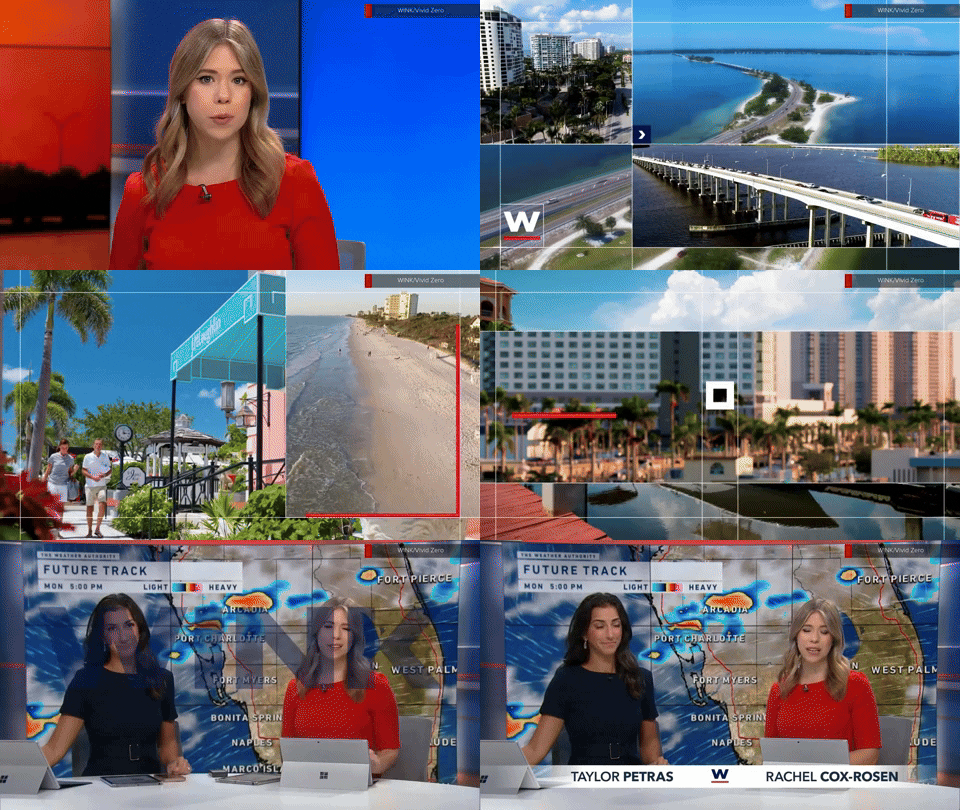
One of the most prominent places this is on display is in the opens, which are designed to be easily modified with timely imagery and even live footage and serve as a way to spotlight local flavor and scenery, according to Vivid Zero.

An expanded view of the ‘content open’ design. In this example, the viewer only sees about a fourth of the design at a time.
The package also includes what Vivid Zero calls “content opens” that are used for pre-show teases and promoting what’s coming up on the other side of a break. For these, the entire sequence is imagined as a cohesive, wide, panoramic-like canvas, as shown in its entirety above.

The viewer only sees a standard 16:9 portion of the imaginary space at a time but smooth left-to-right viewport moves create the impression of a continuous sequence with different parts that are revealed in sequence.
Aside from the final view of the logo, each of these scenes includes a square primary image with space for a headline or other text. A smaller box in the upper left can be used for messaging such as “up next” but also providing dynamic, useful information, including a mini weather forecast or current date.
Content opens are set against a deep blue background with white boxes for text and red accents.
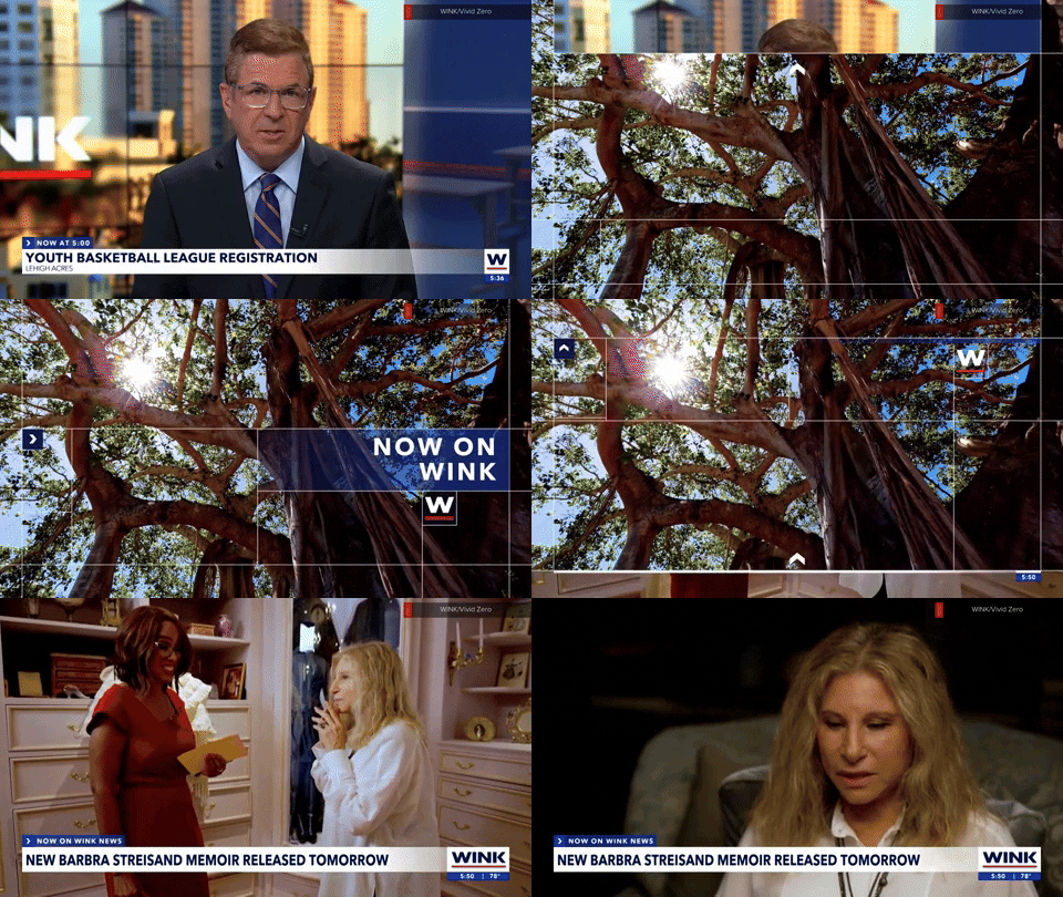
Vivid Zero also created “mini-opens,” or stingers, used throughout the newscast to introduce segments or franchises or serve as a transitional element.
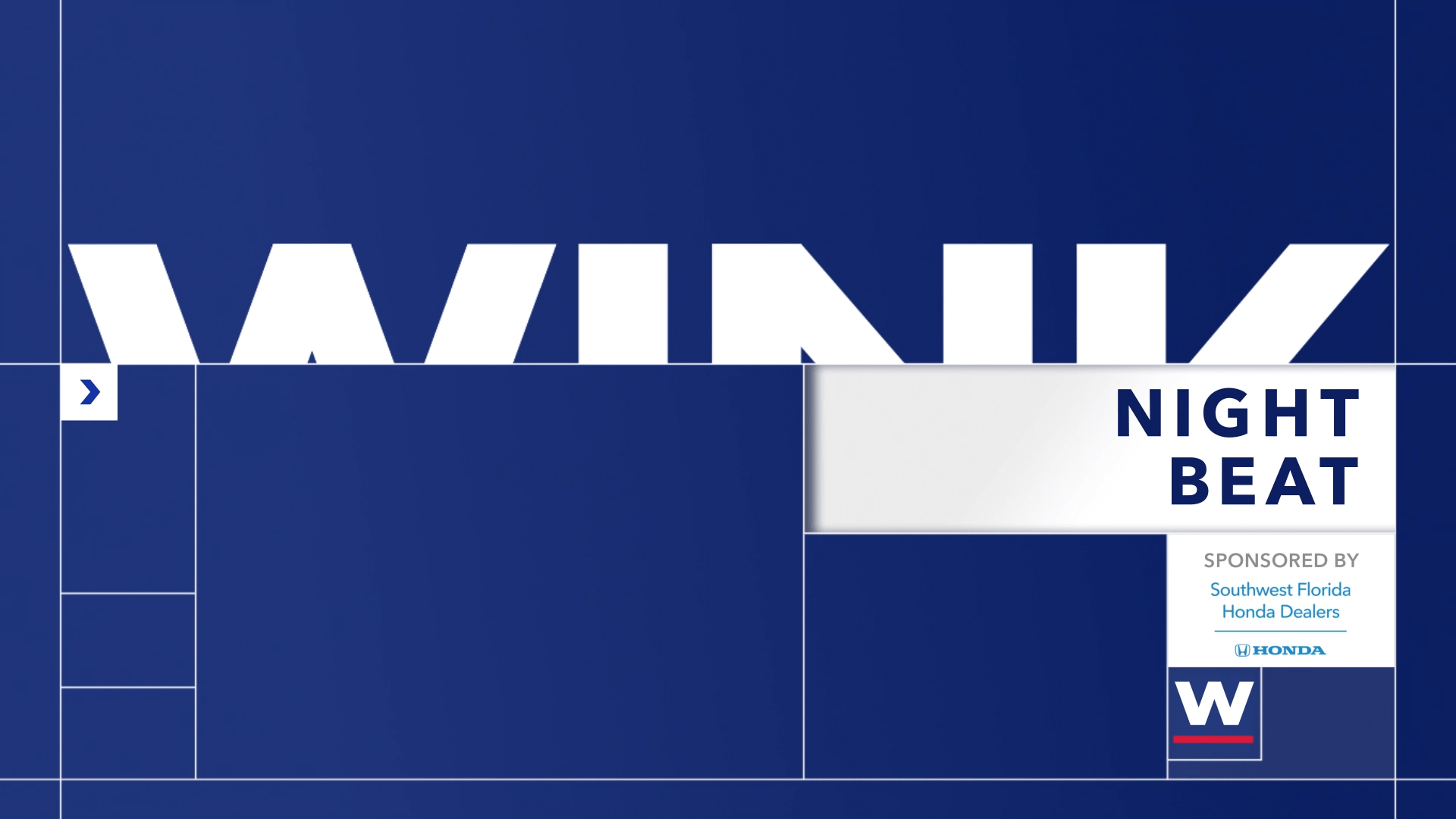
These designs also have various options for visuals, including adding unique imagery and text as needed. More generic looks are also available with solid backgrounds, including a default blue option or red and white for breaking news.
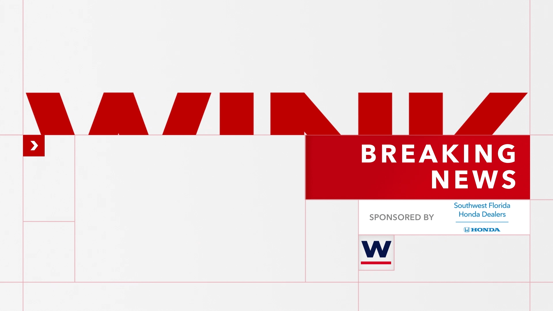
Many of these sequences also feature the “W” icon — and additional modules can be blended in as needed, including current weather conditions or sponsorship logos in a variety of sizes and locations.
Another common element is an oversized iteration of the logo bisected horizontally by a line. Despite roughly half of the lettering being obscured, the letters still read as “WINK,” especially if the viewer is familiar with the name.
In this article:
- Logo, icon and K-point
- Visual language, animation and opens
- Lower thirds, insert graphics, tickers and bugs
- Weather graphics
- Fullscreen graphics, wipes and video wall graphics
Subscribe to NewscastStudio for the latest news, project case studies and product announcements in broadcast technology, creative design and engineering delivered to your inbox.



tags
Ft. Myers, logo design, SmithGeiger, Vivid Zero, wink
categories
Branding, Broadcast Design, Broadcast Industry News, Graphics, Heroes, Local News, TV News Graphics Package