
A look back at the ‘PBS News Hour’ over the years
Subscribe to NewscastStudio for the latest news, project case studies and product announcements in broadcast technology, creative design and engineering delivered to your inbox.
Since debuting in 1975, the broadcast now known as “PBS News Hour” has sported a variety of studio sets, each becoming increasingly more sophisticated.
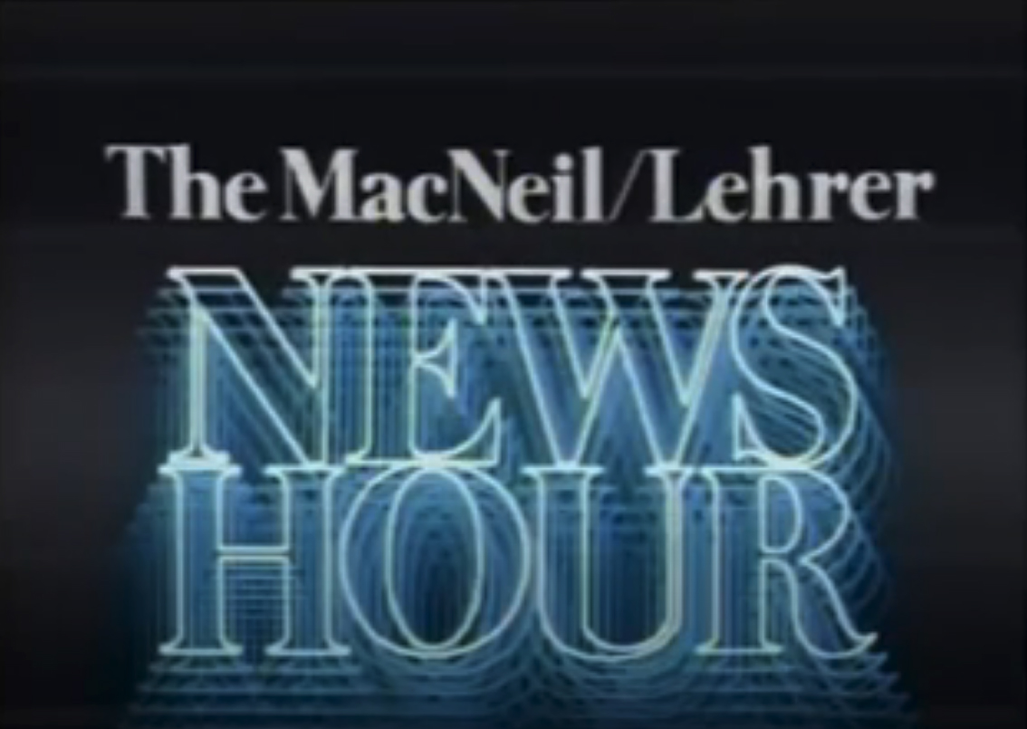
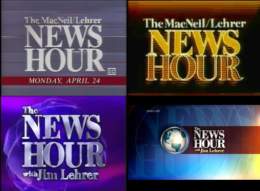
The PBS mainstay was originally titled “The Robert MacNeil Report” from 1975 to 1976 and spent much of its life under the “The MacNeil/Lehrer NewsHour” banner.
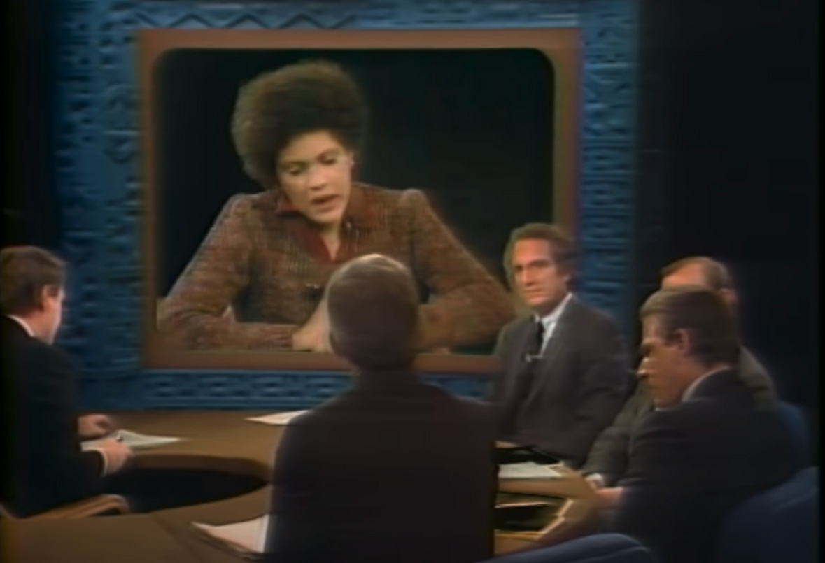
When it debuted, the show used a dark look that combined black backgrounds with what appeared to be carved panels that could be lit with various colors. Decorative accent lighting appearing in some shots as well.
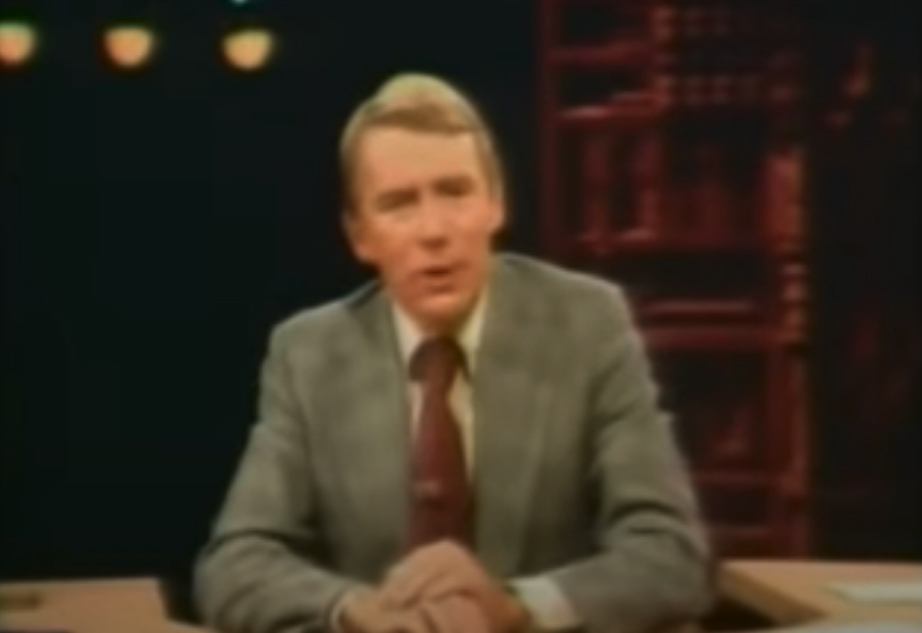
During the years MacNeil anchored, he was based at PBS member station WNET in New York City. When Jim Lehrer joined the show shortly after, he would typically anchor from studios near the WETA building in Arlington, Virginia.
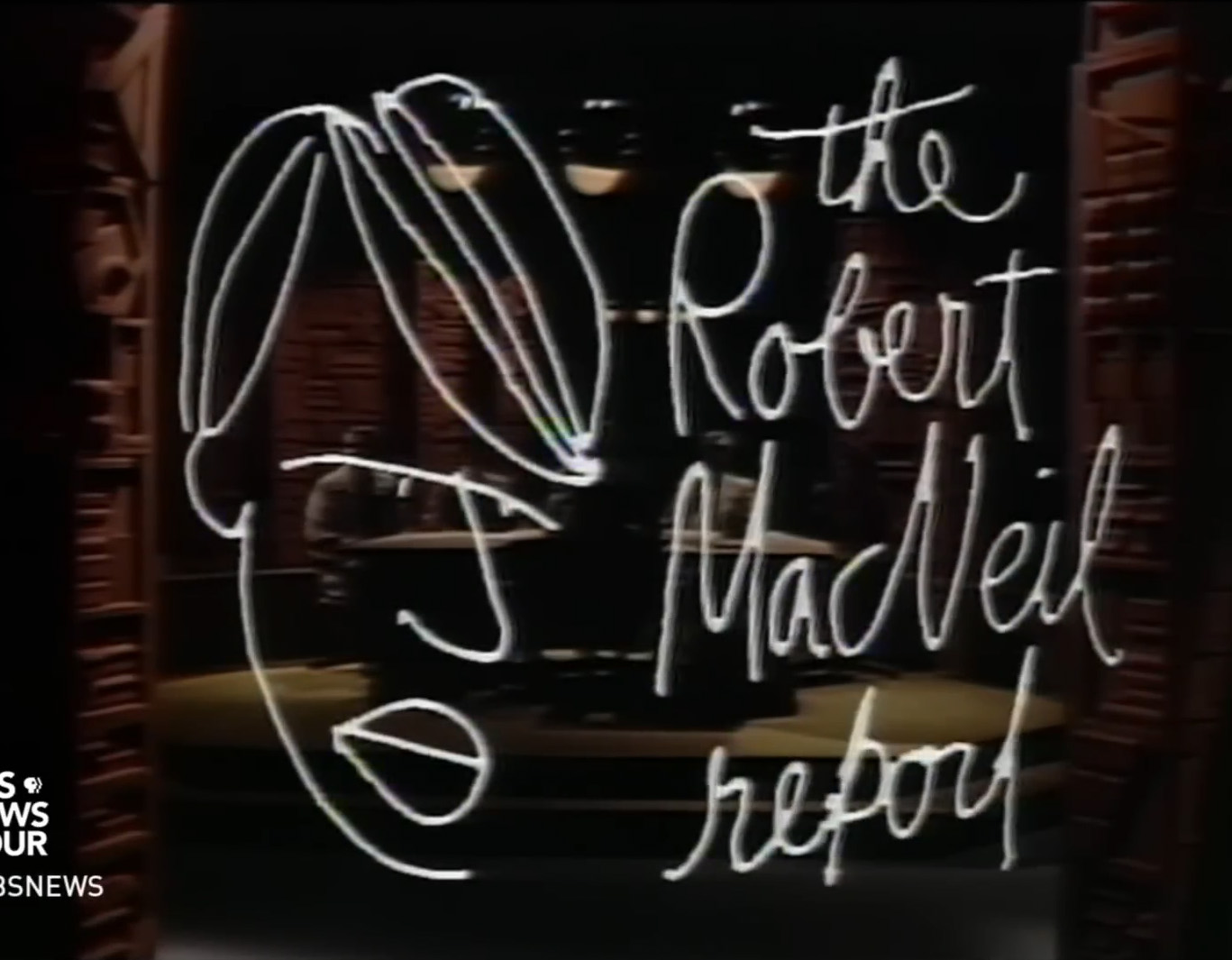
During its early years, the show used a series of graphics that appeared handwritten and, in the case of the original title card, drawn.
Before Lehrer, this look included a hand-drawn caricature of MacNeil.
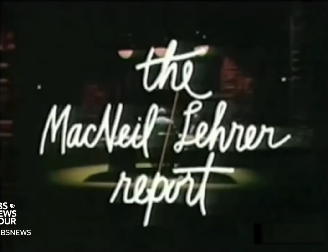
The look was refined when Lehrer’s name was added. The graphical motif of the slash was also introduced, playing a key part in the show’s basic animations.
When Lehrer came on board, a version of the studio was created in Arlington. Both studios used variations of an element that would stick with the show for years to come — U-shaped anchor desks that, when shot wide, seemingly enveloped the anchor.
The broadcast became known for its large in-studio panel discussions, including the ability to bring in remote guests using scenic walls outfitted with chroma key pieces used to simulate what would today be likely done with LED walls or large TV screens.
After switching to a condensed sans-serif logo for a period, the show introduced the basis of what would become one of its longest looks in the mid-1990s.
The new design switched to an elegant sans serif. The word “NewsHour” was typically broken in two and stacked.
During this period, the broadcast also switched to a linear background motif in the studio.
The colors over the years, and the exact composition would change as well, shifting from broader segments to thinner ones in blues and reds. The designs included both vertical and diagonal lines running through the patterns as well.
Backgrounds were also introduced that featured repeating versions of the show logo, step-and-repeat style. Other layouts used over the years included ones with diagonal line patterns as well as cloudier backgrounds without strong linear elements.
In some cases, the spaces used for the nightly news summary and other straightforward reporting used one set of backgrounds, while the interview venue, whether in-studio or remote, had a slightly different look.
The show continued to use chroma key set pieces to simulate large screens when rear projection technology on news sets was in its early years.
While these simple backgrounds seem comparatively primitive by today’s standards, there’s also a certain understated elegance to them, especially when considered from today’s design aesthetic.
The show also used a variety of other graphics throughout the years, including one that featured similar red, white and blue linear elements as found on the set backgrounds.
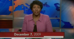
In 2009, the broadcast switched to a drastic new look — a multivenue studio created by Jack Morton Worldwide.
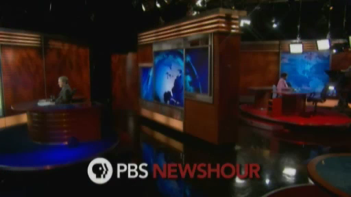
The update introduced a more structural feel to the broadcast, rather than the notion that it originated from in front of a series of backgrounds.
The new set also added rich wood tones along with printed backlit duratrans sporting a world map motif, with less emphasis on lines, diagonals, or logos in backgrounds.
Linear elements remained largely in the form of the internally lit studio headers and wood-toned accent panels with reveal lines.
Blue, red, and tans were also used throughout the design, echoing some of the broadcast’s earlier looks. The space would be updated over the years with new backgrounds, updated anchor desks, and the addition of technology.
In 2015, the broadcast switched directions again — this time with an airy, clean and modern look reminiscent of more European design.
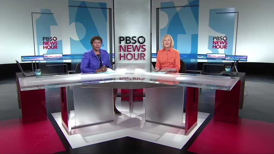
Created by Eric Siegel and George Allison, this studio largely removed any notion of walls, instead opting for freestanding, often movable scenery with transparent glass panels in blue, red and yellow.
The broadcast also added a vertical video screen camera center at home base and in the secondary venues. A long ribbon of LED was also installed directly behind the anchors. It typically displayed a looping animation with a linear feel that incorporated both laser lines and light bursts.
“PBS NewsHour” has continued evolving its look with a fresh take on the 2015 set.
The studio is now physically inside of the WETA’s building, thanks to an expansion project with three studios and a newsroom for “PBS NewsHour” and “Washington Week with The Atlantic,” the latter of which is also slated to share Studio A with “NewsHour.”
Perhaps the most significant update is the addition of over 50 linear feet of seamless LED video walls, an investment that allows the space to be even more flexible, especially when giving each broadcast its own unique look.
For years, “NewsHour” appeared to focus much of its budget on content rather than visuals. Though exact budgets are not public, it’s unlikely that “NewsHour” spends anywhere close to what it costs to produce a 30-minute newscast on one of the “big three” networks (or, for that matter, what these networks spend on scenic design and technology).
Lower budget productions often have a simpler look and feel that are easy to write off and group into the term “public television.” However, “News Hour” has been increasingly stepping up its game in terms of on-air look and visual storytelling, leaving that tongue-in-cheek reference less relevant.
While prices on seamless LED video tiles have come down, they are still a significant investment for any broadcaster and their appearance on the “News Hour” is not only a sign that the team behind the broadcast is eager to evolve and invest in their product, but also how these storytelling tools are becoming so mainstream that newscasts can feel incomplete without them.
Subscribe to NewscastStudio for the latest news, project case studies and product announcements in broadcast technology, creative design and engineering delivered to your inbox.

tags
jim lehrer, PBS, PBS News Hour, weta, wnet
categories
Broadcast Industry News, Featured, Set Design