
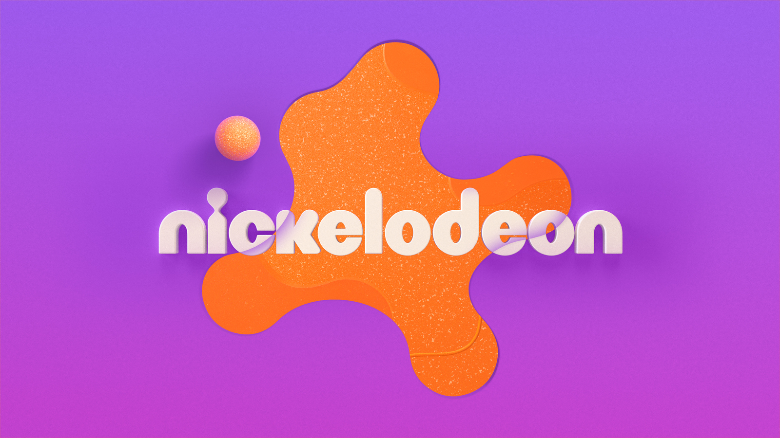
Nickelodeon gets a facelift that brings new splash to the Splat!
Subscribe to NewscastStudio for the latest news, project case studies and product announcements in broadcast technology, creative design and engineering delivered to your inbox.
After 14 years without a significant on-air refresh, Nickelodeon has reimagined its brand identity in collaboration with agency Roger. This comprehensive revamp reinterprets the emblematic “Splat” logo, injecting new life into the brand without losing touch with its network’s past.
The initiative has culminated in a brand identity that exhibits Nickelodeon’s enduring commitment to its young audience while simultaneously elevating the brand to compete in an increasingly crowded market. The updated Splat logo, central to Nickelodeon’s identity, is now set against a backdrop of rounded graphics and vibrant colors, reinforcing the network’s reputation for championing the joy and creativity of childhood.
Beyond reshaping the core brand, Roger also partnered with Nickelodeon’s in-house teams to strategize product designs and enhance their resort experiences, as well as optimize attribution on various digital and SVOD platforms.
“We have an immensely talented in-house creative and motion design team at Nickelodeon, so the bar is set very high for design and even higher for mess,” said Vincent Aricco, SVP and global executive creative director, Nickelodeon.
“The team at Roger are incredible collaborators and felt like an extension of our phenomenal in-house team. They embraced the elements that make Nickelodeon a brand that continues to resonate with kids and families 40-plus years into the game – irreverent humor, a love of all things messy, and a penchant for creating larger-than-life moments that magnify the best of what it means to be a kid – and produced a modernized visual identity that is the perfect marriage of innovative design and just the right amount of weird.”
New vision, same core
Aricco notes the goal was not only to modern the brand but also to preserve the network’s signature charm. The updated look retains Nickelodeon’s key pillars — irreverent humor, affinity for all things messy and the spirit of celebrating childhood — in a visually appealing and compelling format.


Under the leadership of Roger’s Terry Lee and Braden Wheeler, the team aimed to create a flexible and evolving identity that reflects Nickelodeon’s broad creative repertoire. According to Wheeler, the challenge was to craft a design language that maintained coherence across all of Nickelodeon’s channels while allowing room for “revisionism, randomness, and irreverence.”
“We love a brief that asks us to tap into our weirdo kid brains,” said Wheeler. “Kids are all about trying everything out, so we wanted to make a brand that allowed for revisionism, randomness, and irreverence. That said, the design language needed consistency across every touchpoint of the Nickelodeon brand, from on-air to digital and social media to the product packaging and resort experiences, so we knew we needed a very accessible core to the visual identity.”
The team successfully met the challenge by leveraging a circular grid system, which they used to create the new Splat design. This innovative approach allows for the development of complementary shapes, seamlessly linking the various elements of the brand.

An example of the grid system.
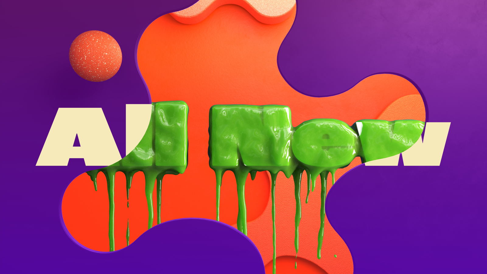
In addition, the new brand employs a motion language that marries traditional cel animation with modern 3D design. Paired with bold and clean typography, this fusion delivers a contemporary yet nostalgic feel that resonates with Nickelodeon’s legacy.
An ode to real kids
Adding a layer of creativity to the rebrand, the live-action IDs produced by Roger present a celebration of childhood in its most authentic form. Instead of using professional child actors or animations, Roger turned to real kids, empowering them to explore their imaginations on camera.
From painting murals to noodle-slurping contests, these IDs depict children reveling in their natural, often messy, environments. These sequences capture the spirit of the Nickelodeon brand.
The inclusion of the live-action IDs into the rebrand not only brings a tangible touch of reality to the identity but also supports Nickelodeon’s commitment to representing the true essence of being a kid. By showcasing children enjoying the freedom to express their imaginative ideas and engage in playful antics, the IDs deliver an authentic and relatable experience for the audience, further reinforcing Nickelodeon’s standing as a leader in kids’ entertainment.
A palette that pops
The color palette takes its inspiration from Nickelodeon’s signature orange, extended with gradients of purples, yellows, and pinks, introducing a vibrant freshness to the brand. The typography, featuring ROC Grotesk and Neue Plak, injects an element of the network’s irreverent DNA into the design, offering the brand plenty of room for future evolution.
“We aimed to infuse a sense of imagination and exploration into every deliverable and design choice in a quite literal sense, with elements reinventing themselves in real-time,” said Wheeler. “It was a tightrope balance between eclectic and cohesive, but the modularity built into the system gives Nickelodeon the flexibility to play in their sandbox and build upon the brand for years to come as new IPs and initiatives are introduced. Flexibility was always at the forefront of our thinking.”
![]()

Nick Jr. will also see a complete rebrand in September, rolling out new assets across digital and linear channels. The fresh look, anchored by the network’s iconic orange Splat logo, features a lively new palette, innovative graphics and animated idents to captivate young viewers.
Project Credits
- Client: Nickelodeon
- EVP, Global Kids & Family Marketing: Sabrina Caluori
- SVP, Global Creative: Vincent Aricco
- Executive Producer: Danielle Jotham
- SVP, Design & Motion: Michael Waldron
- Branding & Design Agency: Roger
- Executive Creative Director: Terence Lee
- Creative Director: Braden Wheeler
- Executive Producer: Josh Libitsky
- Head of Production: Anne Pendola
- Line Producer: Christian Kendrick
- Post Producer: Tara Danna
- Art Director: Rob Modini
- Technical Director: Alex Van Dyne
- Editor: Patrick Nagy
Subscribe to NewscastStudio for the latest news, project case studies and product announcements in broadcast technology, creative design and engineering delivered to your inbox.

tags
Branding, Nickelodeon, rebranding, Roger
categories
Branding, Broadcast Design, Graphics, Graphics Systems, Heroes, Network Branding