ABCNews.com rolls out design update that improves readability
Subscribe to NewscastStudio for the latest news, project case studies and product announcements in broadcast technology, creative design and engineering delivered to your inbox.
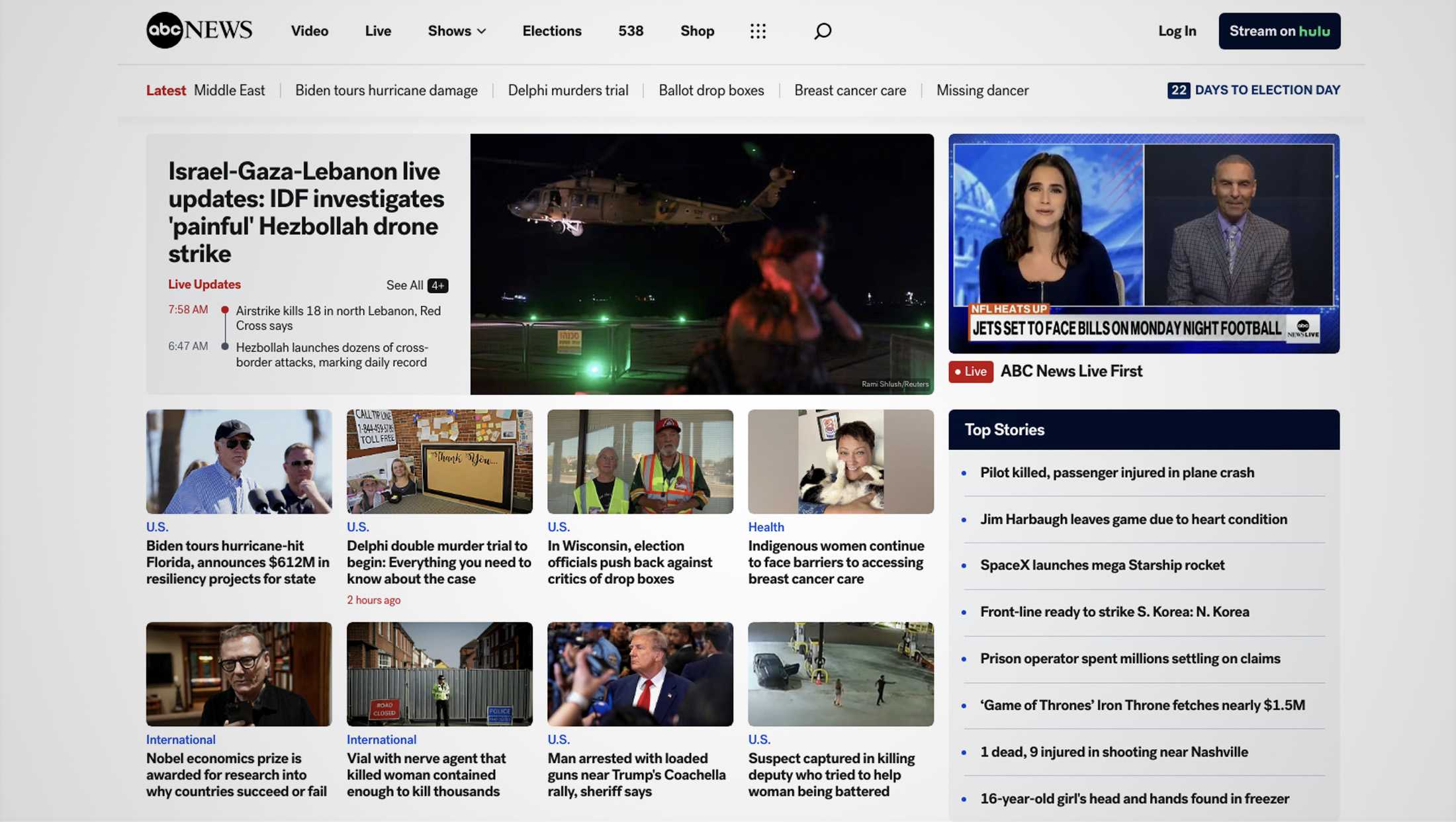
ABCNews.com unveiled a design update in October 2024 that streamlines the pages’ looks and provides bolder, cleaner typography.
The most noticeable change is that most headlines have switched from the serif Tiempos Headline to bold Post Grotesk, a sans serif.
Prior to the design changes, the site used Post Grotesk as more of a secondary typeface that was used for elements such as section headings, photo captions and overlay text.
The new site retains Tiempos Text for body copy.
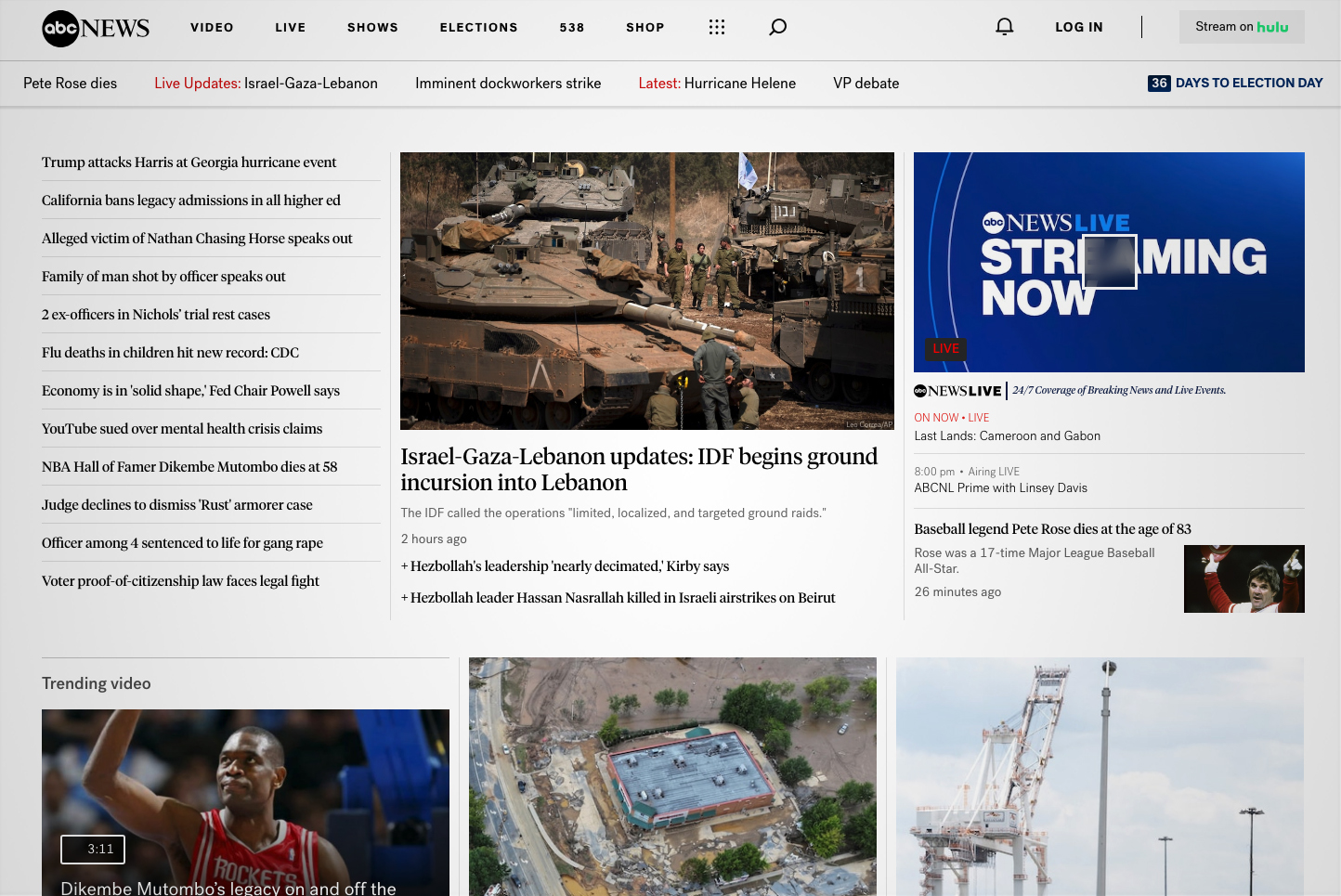
An Oct. 1, 2024, capture of the ABCNews.com homepage showing the old layout and typography. Image via Internet Archive.
Overall, the font updates make headlines easier to scan, especially on the homepage. Switching to a bolder version of Post Grotesk also improves readability significantly while not occupying significantly more screen real estate.
The network’s homepage has also switched to a more boxed layout in favor of the previous column-based look.
In many ways, these boxes, which feature rounded corners, give the site more of a mobile or connected TV app feel.
The network also switched the “Stream on Hulu” icon to a black background, making it a bit more prominent.

ABC News did not respond to a request for comment on the redesign. Portions of the site, including some section homepages, remain under the old design.
As mentioned, Tiempos has been used on ABCNews.com. It’s worth that both CBSNews.com and NBCNews.com both use variations of the sans serif Publico on their respective sites, a font that has some strong similarities with Tiempos.
Subscribe to NewscastStudio for the latest news, project case studies and product announcements in broadcast technology, creative design and engineering delivered to your inbox.

tags
ABC News, Post Grotesk, Tiempos
categories
Broadcast Business News, Heroes, Networks, Online and Digital Production, Web Design