
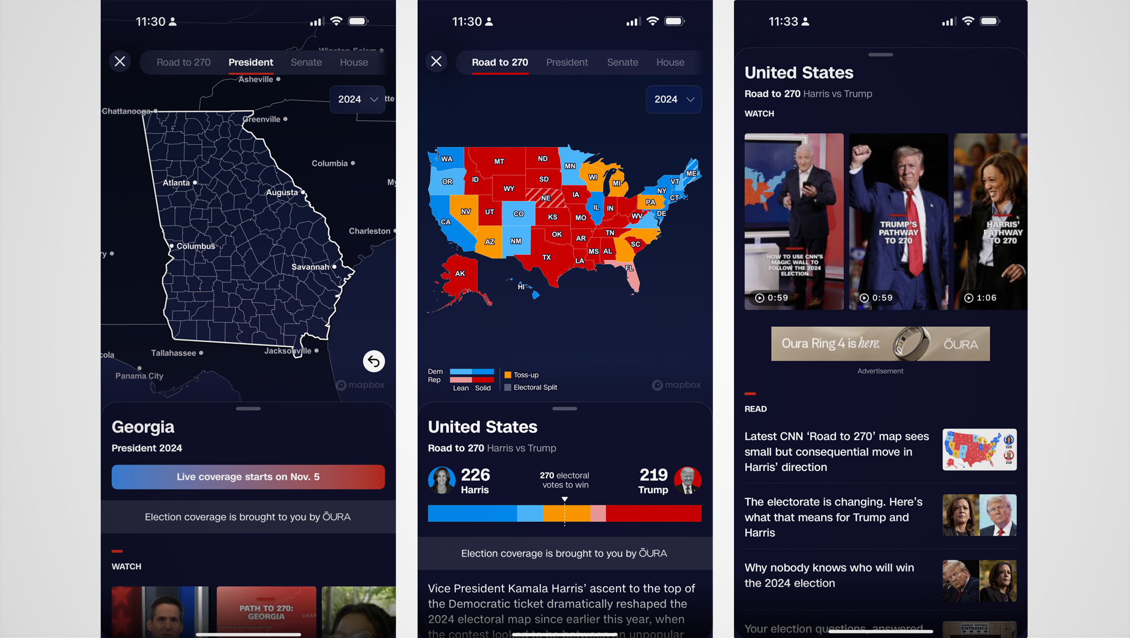
CNN adds ‘Magic Wall’ to mobile, tablet apps
Subscribe to NewscastStudio for the latest news, project case studies and product announcements in broadcast technology, creative design and engineering delivered to your inbox.
CNN has brought its famous “Magic Wall” technology to the masses.
The network rolled out an update to its native iOS and Android apps that adds the interactive map and data tool to smart phones, tablets and connected TVs.
Before election night, the feature is basically just a glorified electoral vote map at the state level complete with current estimates for who might be most likely to take the state.
Come election night, however, the feature will start piping in county-by-county data that can be examined with a zoom and a tap, much like CNN anchor John King does on live TV.
As of now, there is no sign that the feature will be behind the network’s $3.99-a-month subscription plan like its “Road to 270” interactive electoral map scenario builder. The Magic Wall map can’t be changed by the user either, meaning they can’t toggle states from red to blue to see how it affects the electoral college count.
Users with connected TVs and compatible pay TV packages will also be able to watch CNN’s live coverage with Magic Wall data surrounding it in an L-bar layout.
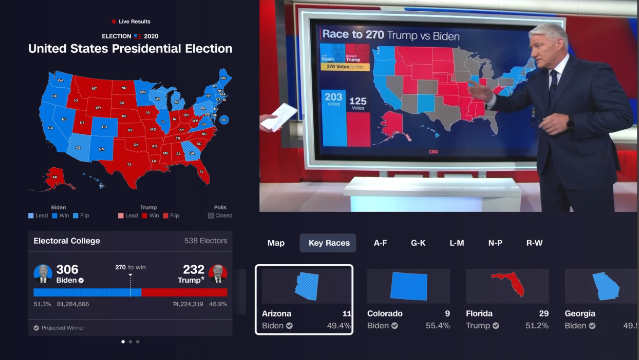
CNN’s Magic Wall dates back to 2008 and has played a prominent part of primary, caucus and election coverage since then, typically with King at the helm. It’s even been spoofed on “Saturday Night Live” and, proving it doesn’t take itself too seriously, King himself used a version of the wall to cover the power struggle in “Game of Thrones” back in May 2016.

To help draw attention to the feature, CNN is using a small red, white and blue icon in the bottom navigation bar inside the app dedicated to the feature.
Since CNN’s introduction of the touchscreen technology with real-time data, other networks have followed suit.
MSNBC has Steve Kornacki’s “Big Board” (complete with the “Kornacki Cam” that often runs during commercial breaks) and Fox has the”Bill-Board,” so named because it’s run by host Bill Hemmer.
At their core, all of these are largely the same. They’re essentially large video panels with touchscreen technology. They’re hooked up to a computer system that allows talent to bring up a wide array of data on a whim — so it doesn’t require stacking a forecast like with a weather system, for example.
Many of them also include subtle icons or other navigational elements meant for the host to be able to tap to switch between different types of data or graphics, which are also typically created in real-time and updated as results come in.
The software is integrated with voting data that is updated automatically, with numbers often adjusting on-air. Exit polling data can also be integrated and most screens can also be drawn on to highlight a certain area or figure or do some quick off-the-cuff math.
NBC and MSNBC have also extended Kornacki’s knack for numbers into sports or other news stories, with him presenting interactive touchscreen graphics helping viewers track data such as standings, world records and other player or team stats, though in these cases the interface may not be as sophisticated as his election Big Boards — or rely on real-time data.
Subscribe to NewscastStudio for the latest news, project case studies and product announcements in broadcast technology, creative design and engineering delivered to your inbox.

tags
2024 Election, CNN, john king, magic wall, touchscreen
categories
Broadcast Business News, Broadcast Industry News, Cable News, Elections, Heroes