
Max launches monochromatic new brand that ties in to HBO
Subscribe to NewscastStudio for the latest news, project case studies and product announcements in broadcast technology, creative design and engineering delivered to your inbox.
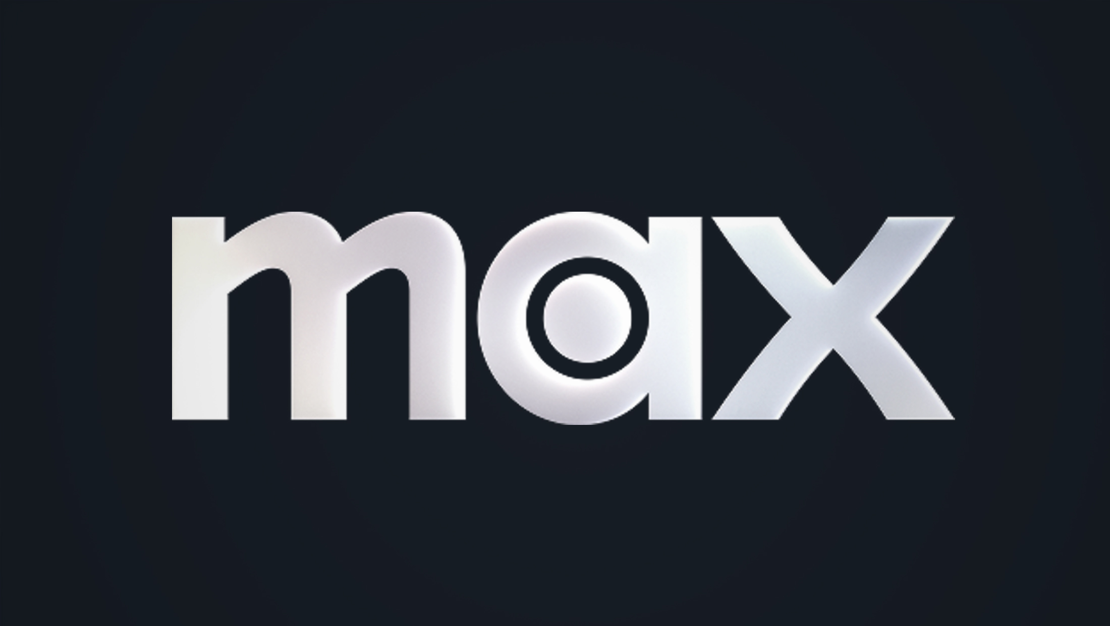
Max, Warner Bros. Discovery’s streamer, has introduced a rebranding effort that shifts its once sharp blue to a much more subdued look that appears to be an attempt to align it more with the HBO brand.
The changes, which started rolling out March 30, 2025, saw the streamer keeping its standalone “Max” wordmark that it introduced in 2023 after changing its name from “HBO Max” to simply “Max.”
What’s different, however, is that the logo’s preferred lockup now appears in front of an almost-black background, as opposed to the blue shade it used since that same 2023 update.
Link to HBO?
The redesign has prompted numerous comparisons to the HBO brand, which has largely relied on a similar dark, monochromatic black-and-white look since 1980.
Some have noted that incorporating elements from the HBO look makes sense in a world where the lines between streaming and linear TV are becoming increasingly blurred. On the other hand, there’s also been criticism of how the change is cannibalizing the HBO brand and the potential for confusion between HBO and Max.
That said, the synergy between the two brands, which still operate as both separate and blended entities, has been around for the entire life of the streamer.
Its debut name, “HBO Max,” literally included the HBO name and wordmark as part of the service’s logo design. When WBD rebranded the streamer as just “Max,” the familiar circle-inside-a-circle bullseye remained in the standalone Max logo in the middle of the “a” (as opposed to the “O” in the HBO version).
Dropping “HBO” from the streaming service’s name in 2023 was largely billed as a way to help distinguish it from the premium linear channel as well as the now-defunct streaming offerings HBO Go and HBO Now, but, at the same, time, it appears WBD still wanted to keep at least some of that connection alive, as evidenced by incorporating the bullseye element in the new logo.
Now, with the color changes, it appears WBD is embracing at least a bit more of its ties to HBO.
If one is a fan of the strategy that WBD’s streaming video-on-demand offerings have become clouded in consumers’ minds and its multi-pronged approach is effective, then the new branding likely makes a lot of sense.
On the other hand, if one takes the perspective that WBD should still try to distinguish between Max and HBO, it’s probably not quite as effective.
The Max logo itself, which didn’t change its basic look, has been the subject of its own set of criticisms, including over the strict, geometric “a” compared to the more flowing “m” and “x” — as well as some odd inconsistencies between the latter two characters.
Interestingly, Paramount+ actually took a different route in 2022 when its parent decided to merge Paramount+ and its premium cable channel Showtime, a move that technically included rebranding the service as “”Paramount+ with Showtime,” a name that likely rarely passed the lips of viewers and has ultimately shifted to the use of “Paramount+ now includes Showtime” as more of tagline than name.
Not quite black
Although multiple reports have labeled the Max brand update as a switch to black and white, that’s technically not correct.
The “black” being used could actually more accurately be described as a “very dark blue-violet.” According to an examination of the underlying code on the Max.com website, the homepage’s background carries the RGB value of 18, 12, 29 (HSL value of 216, 52, 11), meaning it has levels of 18% red, 12% green and 29% blue (the higher value of the blue, 29%, lends credence to the notion that the color is somewhere in the blue-violet realm).
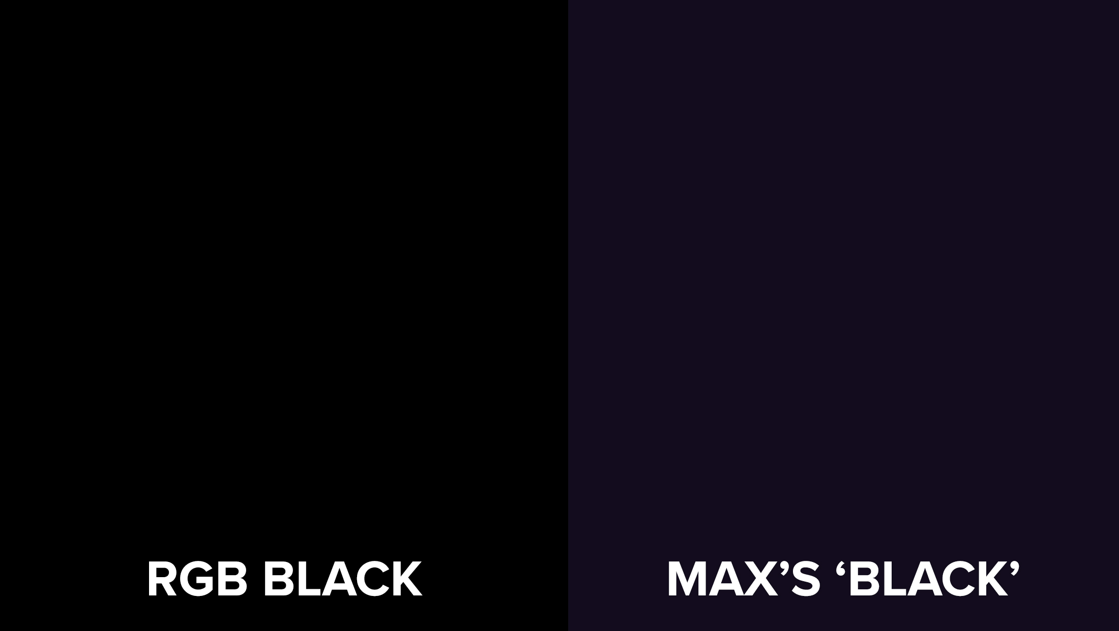
This comparison image, created by NewscastStudio, shows ‘true’ RGB black on the left and the Max ‘black’ as taken from the RGB code on the updated website’s background. There are variations of the background shade used throughout the new look.
Although the difference is subtle, color theory purists will argue that “black” only applies to something with the RGB value of 0, 0, 0.
On a broader scale, it’s not uncommon for both print and digital designers to avoid using “true black.” In CMYK printing, “rich black,” mostly commonly defined as 60% cyan, 40% magenta, 40% yellow and 100% black, is often used to achieve a deeper, fuller look that most humans still read as black. On screens, which typically use the RGB color space, pure black is often avoided because it can cause too much contrast that’s not easy on the eyes against a pure white or lighter background, so the solution is to let subtle amounts of red, blue and green in to help offset that.
In most versions of the updated Max logo, there is also a subtle wash of pale colors, ranging roughly from yellow to violet, going from left to right.
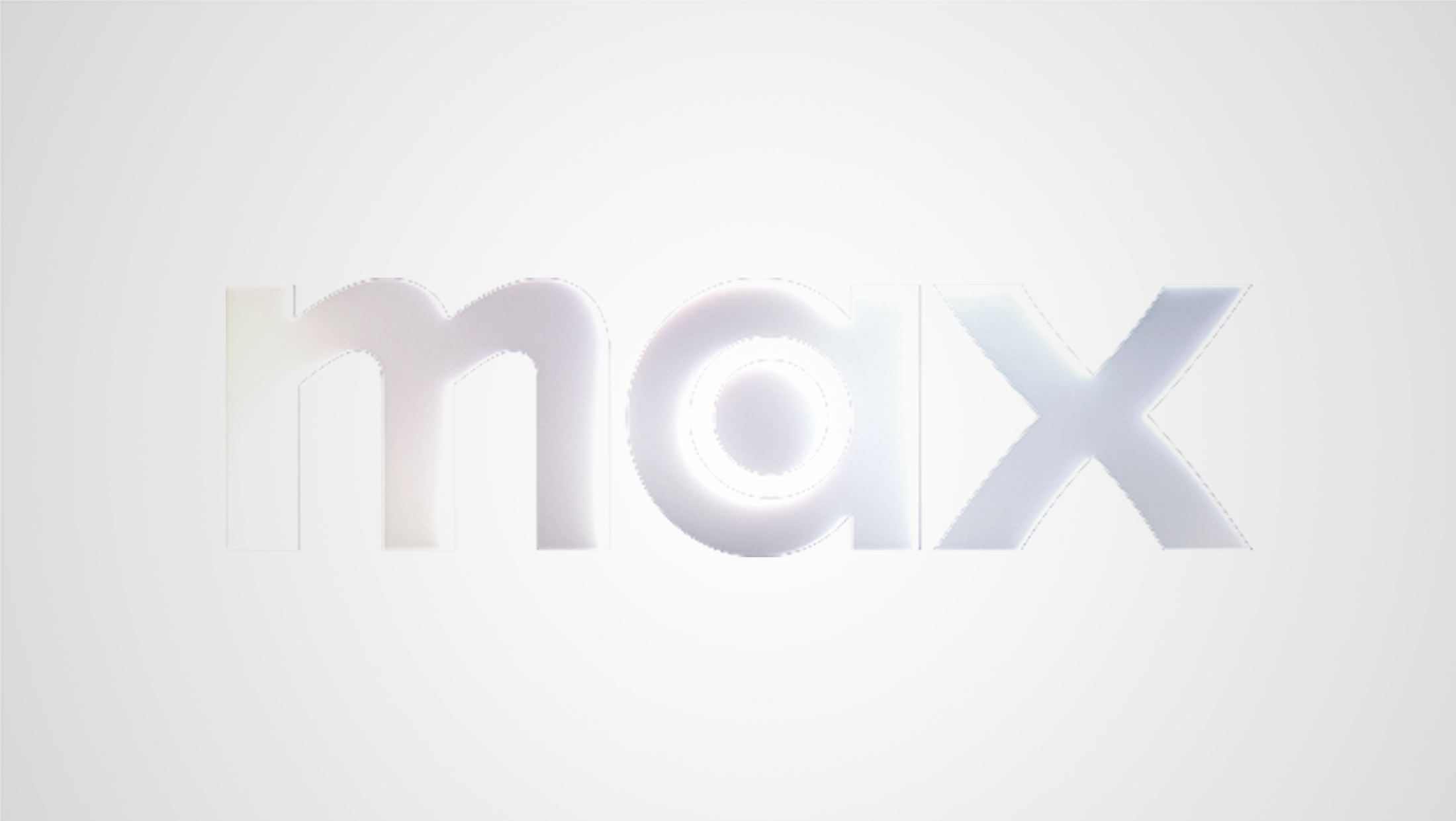
In this illustrative image, created by NewscastStudio from the Max logo file on Max.com, the color wash is more evident to many than when the wordmark is shown against a darker background.
When the logo is placed against the “almost-black” background, the color wash tends to become even more subtle, so, in the image above, the background has been swapped out to a lighter shade, which makes the colors more apparent. The wash becomes less visible as the logo gets smaller, though most eyeballs are likely to pick up at least a sort of “shimmer” effect.
All that said, the new Max look still certainly gives off a “back and white” vibe — and it certainly sounds better than “very-dark-blue-violet-and-white.”

Ties to a ‘noisy’ production logo
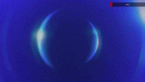
In fact, there’s actually some branding precedent for including both off-black and hints of color, thanks to the iconic HBO production logo that runs ahead of its productions, which features a simulated clip of analog signal noise.

Although there have been variations of the sequence over the years, its concept has remained essentially the same — the screen flickers to life as if someone is turning on an older model television that also happens to be picking up video signal noise, which is often referred to as “snow,” “static” or “dots,” and is an effect of electrostatic phenomena.

Detail of the ‘noise’ clip used by HBO’s current vanity card.
This noise is most commonly thought of as black and white, but certain models and situations could make dots of color appear.
![]()
In the current sequence, the HBO logo transitions briefly through a grayish shade that could be seen as having hints of blue and violet, which, in turn, is similar to some early iterations of the channel’s look for its logo, including the space-themed vanity logos used in the 1980s.
![]()
Despite true signal noise being seen less often in today’s world, as a visual, it still remains largely linked with television; it’s even used as a quick transitional effect where there is an abrupt change or the fictional or actual action on-screen suggests that a signal was cut or otherwise interfered with.
In many ways, the noise clip HBO uses actually serves as a sort of segue to the new colors in both the logo wash and background shade.
Why drop blue?
There hasn’t been any immediate official word on why the streamer dropped the blue it replaced violet with in 2023. Although blue is a common color in television, there’s still a fair amount flexibility to create multiple colors that are distinctive enough to avoid confusion.
That said, blue continues to be used by fellow major streamers Paramount+ and Prime Video and the variations aren’t quite as distinct as many execs might like.
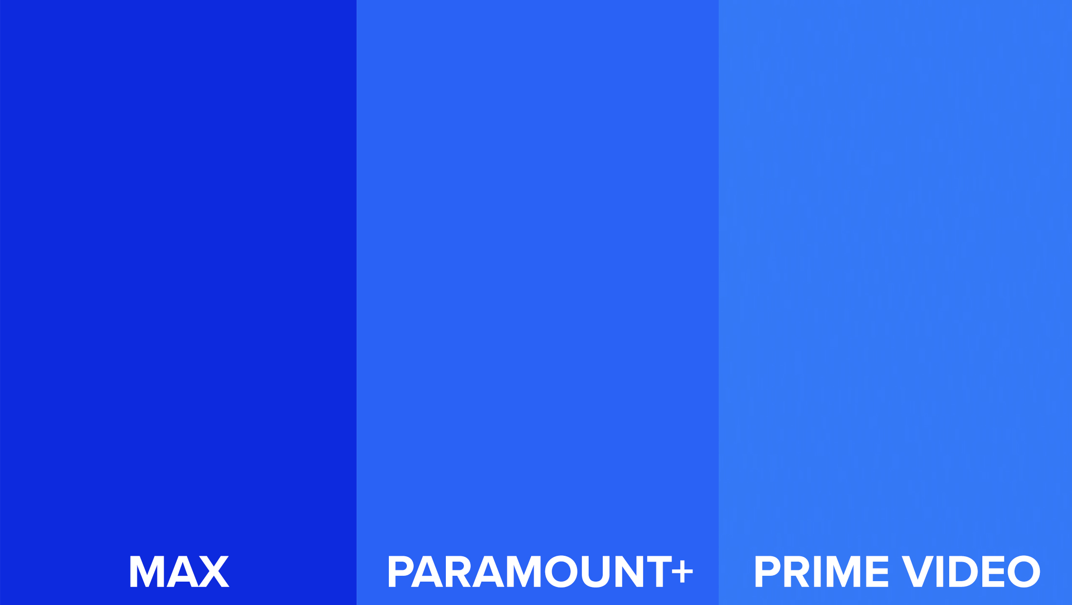
This comparison image shows the RGB colors used by, from left, Max (until 2025), Paramount+ and Prime Video.
There would actually be even more blues in streaming if Disney+ hadn’t changed its brand color in 2024.
This streamer previously used a dark blue for its wordmark with the “shooting star” element using a gradient of various blues until it changed to a dark green in 2024 after merging backend systems with Hulu. The new color was meant as a nod to Hulu’s distinct bright green while still maintaining a distinct color for Disney+.
Even with Disney+ out of the picture, it’s still understandable that WBD would want to drop the blue shade given that two of its major rivals still use it.
Prime, meanwhile, has gone through several wardrobe changes of various blues and appears to have settled in the current one, at least for now. Amazon as a whole is the middle of a largely oddly-executed brand update that saw updates to its logo, typography and, in the case of its primary mark, an updated shade of orange-red in its trademark “smile.”
Icon-ic change (or, ‘Why did the Max icon change?’)
For streamers, one brand asset that often competes with the actual logo for top billing is the square icons the brand uses to present itself to users on smartphones, connected TVs and other digital platforms.
Since 2023, Max had used a white-on-blue look for its avatar in these cases. Its short, three-letter name also helped significantly here because the entire wordmark could be reproduced in full and remain relatively visible even when the icon became very small (more complex logos such as the other streamers mentioned above, don’t always translate as well).
Now, the Max icon is presented as white on black (though the dark blue-violet shade is used).
Changing the background color of an app icon can be a risky move, given that users often associate a particular color or shade with the app or service in question — and may actually overlook the actual logo inside if it. For example, Netflix managed to confuse at least some of its users when it dropped its icon’s red background in favor of red type on white and, to a lesser extent, when it swapped out the white for black.
The switch to a black-ish background now puts the icon, at least when viewed with a cursory glance, closer to Apple TV and Apple TV+’s look. Apple’s icon logo also benefits from being, essentially, two “characters” — the apple icon and the plus sign — while taking advantage of the fact that the ubiquitous outline of its namesake fruit is often read out as “Apple” by consumers.
In some ways, however, that subtle color wash can actually lend a hand here, creating a visual cue that, on a sort of subconscious level, reads as at least somewhat different. That wash tends to give the wordmark a sort of sheen or glow that, again, might be hard to actually place a finger on, but still plays a role in how the icon comes across. Even at smaller sizes, the wash still stands up surprisingly well.
For Max’s actual updated app interface, it’s tough not to draw comparisons between it and any number of streaming apps that either only offer a “dark”-mode inspired look or let users toggle between that and “light” mode. Before, the blue shade was incorporated into more parts of the UI.
In a broader sense, black (or near black) has emerged as a popular choice for streaming user interfaces, likely because it allows the plentiful boxes of colorful key art to shine through and also has environmental comparisons to darkened movie theaters and other rooms that opt to focus most of the light on the screen to help optimize viewing.
Max Original production logo
WBD also updated the “Max Original” production logo that appears ahead of shows produced for the streamer (the HBO vanity card continues to appear on series that were created for HBO but stream on Max).

On the surface, the vanity logo animation is largely similar with the exception of the color, which is now shifted to black, gray and whites much like the color. The bubble-like circular elements are still visible and the sonic signature remains in place.
One significant update, however, is how the Max logo enters. It appears a concerted effort was made to emphasis that the circular elements are meant to tie into the bullseye of the logo, with the added dimension of suggesting the image of a lens. While the full logo actually enters slightly later in the sequence, hints of the logo now appear ahead of that.
The almost solid white curved segment on the right side of the screen right before a burst of light has been removed, as has the burst itself. Instead of that flare, the space is now filled with a faint, slightly oversized take on the Max mark.
Subscribe to NewscastStudio for the latest news, project case studies and product announcements in broadcast technology, creative design and engineering delivered to your inbox.
tags
Branding, HBO, HBO Go, HBO Max, HBO Now, logo design, max, OTT, production logo, streaming, Warner Bros. Discovery
categories
Branding, Broadcast Industry News, Heroes, Streaming