
ABC goes all out in SOTU graphics, other networks show restraint
Subscribe to NewscastStudio for the latest news, project case studies and product announcements in broadcast technology, creative design and engineering delivered to your inbox.
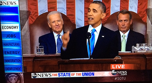
During Tuesday night’s State of the Union coverage, ABC News used perhaps the most unique — and cluttered — graphical approach, while other networks opted for more elegant and even simplistic looks.
As shown above, ABC inserted a sidebar to the left side of the screen that listed key topics the president would discuss in the speech and highlighted each one as he mentioned it, removing the areas that were already addressed.
The bottom of ABC’s screen, meanwhile, included a white bar with a the “ABC News” logo awkwardly squeezed into it and the words “The State of the Union” in red and blue. A rather large “Live” bug appeared on the right side of the screen, above an animated ABC and ABCNews.com bug and hashtag.
The network also added “Trending Now on Facebook” lower third graphics that transitioned using a flipping effect.
Overall, the bold and garish colors, large typography and not-so-subtle animations gave ABC’s coverage a cluttered look and feel.
NBC, meanwhile, opted for more elegant graphics and used a rather large, single color bug that alternated between text reading “NBCNews.com” and “#NBCPolitics” below. The bug itself was placed in a semi-transparent black box.

NBC also used colorful but subtle lower thirds to highlight the names and roles of audience members as well as a white “Live” bug in the upper left corner.


NBC also made use of a sidebar that would appear during key points in the speech to highlight memorable quotes or provide additional information about the current topic.

Meanwhile, CBS used a dark blue bar that ran across the bottom of the screen in conjunction with its normal bug. The network added three stars to the left. Text in the blue bar, meanwhile, was significantly spread out, making it a bit difficult to read.

The other networks, MSNBC, CBS News, showed remarkable restraint in their graphical presentation.

CNN dropped the ticker and opted to only leave its standard “live” bug and 3D metallic State of the Union logo on screen for most of the speech.

MSNBC kept its traditional top bar, colorizing it dark blue, gold and blue, and also included a State of the Union logo, its normal “live” bug and logo and “Lean Forward” animation.

Fox News kept its normal rotating bug in the lower left of the screen and added a 3D rendering of the presidential seal in the other corner.
Subscribe to NewscastStudio for the latest news, project case studies and product announcements in broadcast technology, creative design and engineering delivered to your inbox.

tags
ABC News, CBS News, CNN, Fox News Channel, MSNBC, NBC News, State of the Union
categories
Cable News, Featured, Graphics, Networks