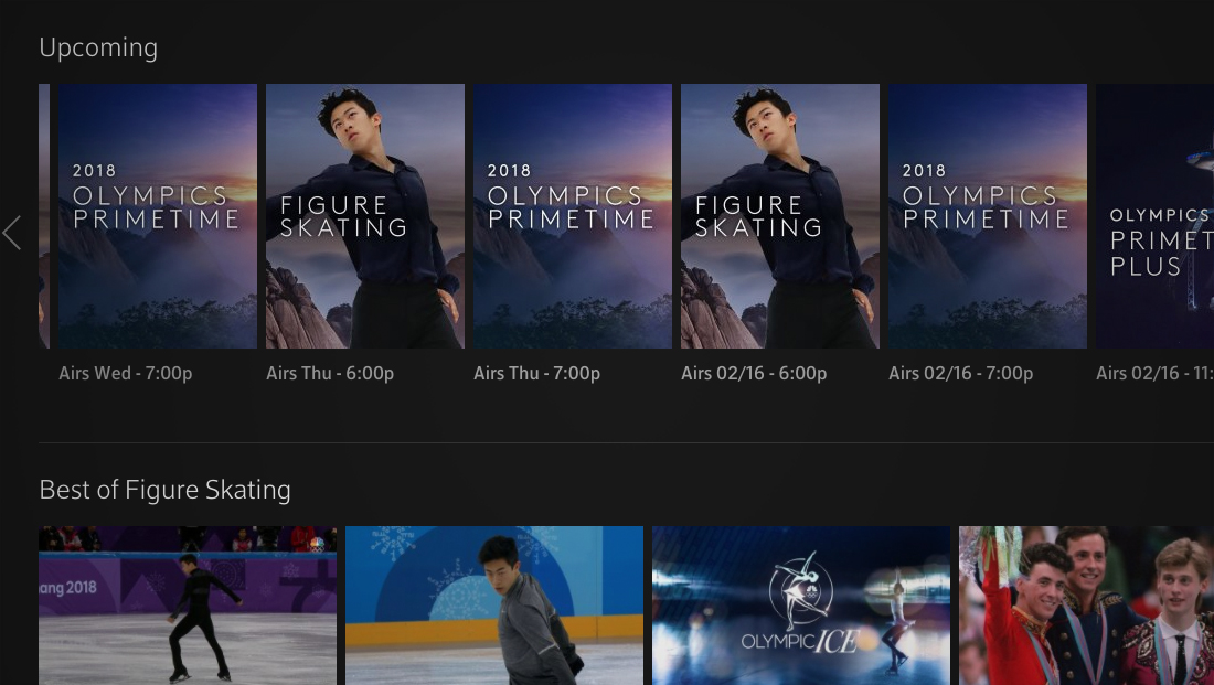
Xfinity bucks NBC’s standard Olympics look in listing graphics

Subscribe to NewscastStudio for the latest news, project case studies and product announcements in broadcast technology, creative design and engineering delivered to your inbox.
Despite being corporate cousins, Comcast’s Xfinity X1 platform opted to use a different look and feel for Olympics programming than NBC for its interactive listing screens.

Instead of the bold, brutalist and tightly kerned font used by NBC that is accented with watercolor-inspired blotches, Xfinity has opted to use a thin, more generously spaced typeface along with dramatic, darkened photographic backgrounds that have been heavily stylized.

The font is notably a close match to the Comcast corporate logo’s typography, which itself is a custom drawn look, and has some notable differences in, for example, the “M” and “C” letters.

Xfinity’s choice to use a different look could have been driven by a desire to better match the platform’s darker, simpler design, or even create a distinct look that’s purposefully different than what viewers will see elsewhere.
However, that difference could also muddy the branding waters for viewers, who have been exposed to the NBC look frequently over the past few months as the network heavily promoted the games.
Subscribe to NewscastStudio for the latest news, project case studies and product announcements in broadcast technology, creative design and engineering delivered to your inbox.


tags
2018 Winter Olympics, comcast, Xfinity
categories
Branding, Broadcast Design, Broadcast Industry News, Featured, Olympics